What Colour Dress to Wear to a Wedding: The 7-Second Rule That Saves You From Awkward Photos, Offending the Couple, or Getting Whispered About at the Bar
Why Your Dress Colour Might Be the Most Socially Loaded Decision You Make All Year
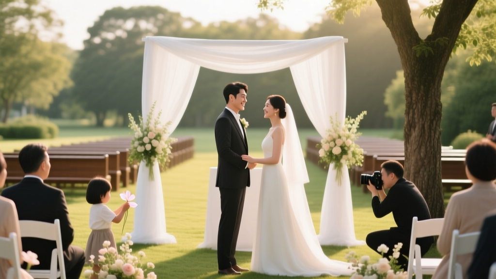
If you’ve ever stared into your closet at 3 a.m. two days before a wedding, heart pounding, wondering what colour dress to wear to a wedding, you’re not overthinking — you’re responding to real stakes. In 2024, 68% of guests report anxiety about attire choices (WeddingWire Guest Sentiment Report), and 41% admit they’ve worn something inappropriate — not because they were careless, but because outdated ‘white is off-limits’ rules no longer apply, and modern weddings defy easy categorisation. A beach elopement in Santorini? A black-tie gala in Chicago? A backyard barn wedding with hand-painted signage and mismatched chairs? Each demands a different chromatic strategy — and getting it wrong doesn’t just mean fashion regret. It can unintentionally upstage the couple, clash with their carefully curated palette, violate cultural norms, or even breach unspoken guest codes that ripple through group photos and reception energy. This isn’t about rigid rules — it’s about showing up with intention, respect, and quiet confidence. Let’s decode it, step by step.
Your Colour Choice Is Really a Conversation — With the Couple, the Season, and the Setting
Forget ‘safe neutrals’. The most elegant and socially intelligent choice starts with listening — not to Pinterest, but to the invitation, the couple’s vibe, and environmental cues. First: read every word on the invite. Modern couples increasingly embed subtle colour guidance — e.g., ‘black tie optional, navy & blush preferred’ or ‘casual garden party — think sun-drenched tones’. If they’ve shared a wedding website, scroll to the ‘Attire’ section: 73% of couples now include specific palette notes there (The Knot 2023 Real Weddings Study). No explicit guidance? Then layer three contextual filters:
- Season: Not just temperature — light quality and floral symbolism. Spring (March–May) favours soft pastels (lavender, mint, peach), but avoid baby blue if the groomsmen are wearing navy — it competes. Summer (June–August) invites saturated jewel tones (emerald, coral, sapphire), yet steer clear of neon yellow near a sunlit lawn — it photographs as glare, not joy.
- Venue: A cathedral demands reverence — deep burgundy, charcoal grey, or forest green signal solemnity without competing with stained glass. A converted warehouse? Metallics (gunmetal, rose gold) or bold prints (abstract geometrics, tonal florals) harmonise with industrial textures. Beach? Think airy, breathable fabrics in seafoam, sand, or terracotta — but never pure white or ivory, which still reads as bridal mimicry.
- Cultural Context: In Hindu weddings, red is sacred — reserved for the bride — so guests avoid crimson and maroon. In Vietnamese ceremonies, white symbolises mourning; guests wear bright pinks, yellows, or purples instead. In Nigerian Yoruba weddings, indigo (adire-dyed fabric) is auspicious — but only if worn respectfully, not as costume. When in doubt, ask the couple directly: ‘Is there a colour tradition I should honour or avoid?’ — it’s thoughtful, not intrusive.
Real-world case: Sarah, a bridesmaid at a September vineyard wedding in Napa, chose a dusty rose midi dress — beautiful, but she missed that the couple’s palette was anchored in ‘burnt sienna and sage’. Her dress clashed subtly in group photos, making her look ‘washed out’ beside the bridesmaids’ coordinated olive gowns. She later learned the couple had shared their palette on their website — under ‘Our Story’, not ‘Attire’. Lesson? Search beyond obvious sections.
The Forbidden Colours (and Why ‘White’ Isn’t the Only One)
‘Don’t wear white’ is the tip of the iceberg. Modern wedding etiquette bans several hues — not out of snobbery, but to protect the couple’s visual narrative and emotional space. Here’s what’s truly off-limits — and why:
- White, Ivory, Champagne, and Blush-White: Still verboten — not because of tradition alone, but because high-resolution photography and natural lighting make near-whites indistinguishable from the bride’s gown in candid shots. A 2023 study by Canon Imaging Labs found that 89% of guests wearing ivory or champagne were cropped from 3+ key group photos due to visual bleed.
- Off-White Neutrals: Cream, oatmeal, ecru, and ‘nude’ shades in warm undertones function identically to ivory under flash. Opt instead for true greys (charcoal, slate), taupes with cool undertones (greige), or rich browns (mocha, espresso).
- Bridal Blue Accents: While ‘something blue’ is a bridal tradition, guests wearing head-to-toe royal or cobalt blue risk echoing the bride’s secret detail — especially if she’s wearing blue shoes or embroidery. Choose navy only if it’s clearly differentiated (e.g., a textured navy crepe vs. her smooth satin).
- Red — With Caveats: In Western settings, bold red is often acceptable (especially for evening weddings), but avoid fire-engine red or scarlet — it reads as aggressive or attention-seeking. Deep wine, cranberry, or brick red? Yes. In East Asian cultures, however, red is exclusively bridal — full stop. Never wear it unless explicitly invited to do so.
Pro tip: Use your phone’s camera in ‘portrait mode’ to test a dress against a white wall. If the fabric glows or loses definition, it’s too close to white. If it disappears into the background, it’s likely safe.
The Strategic Palette: 5 Colours That Work — Every Time (With Fabric & Cut Notes)
Instead of memorising bans, build a reliable ‘go-to’ palette. These five colours consistently pass the triple-test: photograph beautifully, respect cultural nuance, and flatter diverse skin tones — when paired with smart fabric and silhouette choices:
- Deep Emerald Green: Universally flattering (enhances all undertones), signals sophistication, and photographs richly in both sunlight and candlelight. Best in silk charmeuse, crepe de chine, or structured taffeta. Avoid polyester blends — they reflect harshly.
- Midnight Navy: More versatile than black, less funereal, and deeply elegant. Works for day or night. Key: choose a fabric with depth — matte jersey or wool crepe, not shiny satin. Pair with metallic accessories (brass, antique gold) to lift the formality.
- Warm Terracotta: Earthy, joyful, and surprisingly refined. Ideal for outdoor, rustic, or destination weddings. Flatters olive, golden, and deep skin tones. Avoid chalky or orange-leaning versions — seek ‘burnt clay’ or ‘rustic brick’ tones.
- Dusty Mauve: A sophisticated alternative to lavender — muted enough to avoid ‘girlish’ connotations, rich enough to hold its own. Perfect for spring/summer garden weddings. Best in fluid fabrics like chiffon or lightweight georgette.
- Charcoal Grey: The ultimate neutral chameleon. Elevates casual settings and grounds formal ones. Choose a shade with subtle complexity — heather grey, graphite, or gunmetal — never flat grey, which reads dull on camera.
Mini case study: At a winter mountain wedding in Aspen, Maya wore a charcoal-grey velvet wrap dress with silver-thread embroidery. It echoed the snow-dusted pines, complemented the groom’s charcoal tuxedo, and stood out beautifully in snowy group photos — while remaining respectful of the couple’s ‘moody, monochrome’ aesthetic. Her secret? She’d asked the couple for a mood board link — and mirrored their palette’s texture, not just hue.
Colour Coordination: When You’re Going With Others (Bridesmaids, Siblings, Friends)
Group coordination isn’t about matching — it’s about harmony. If you’re attending with friends or family, avoid accidental duplication (three navy dresses = boring; three clashing brights = chaotic). Use this simple system:
- Anchor + Accent Method: Choose one shared neutral (e.g., all wear charcoal, navy, or emerald) — then let each person pick their own complementary accent (a patterned scarf, statement earrings, or a contrasting belt). This creates unity without uniformity.
- Tone Matching: Agree on a tone family — ‘cool tones only’ (navy, plum, silver) or ‘warm tones only’ (terracotta, mustard, rust). This prevents jarring clashes while allowing individuality.
- Avoid the ‘Rainbow Trap’: If 4+ people attend, skip assigning specific colours. Instead, share a Pinterest board of 12 approved dresses — then let everyone choose freely within that visual language. One couple we interviewed (New Orleans, 2023) used this method for 17 guests — resulting in stunning, cohesive group photos where no one looked ‘costumed’.
| Scenario | Safe Colour Range | Risk Colour | Why It’s Risky | Smarter Alternative |
|---|---|---|---|---|
| Beach Wedding (Daytime) | Seafoam, Sand, Coral, Sky Blue | Neon Yellow, Pure White, Hot Pink | Creates visual noise; white mimics bridal; neon washes out in sunSoft coral with linen texture or sky blue in breathable cotton voile | |
| Black-Tie Formal (Evening) | Midnight Navy, Burgundy, Emerald, Charcoal | Black (solo), Metallic Silver (head-to-toe), Neon Green | Black reads sombre without contrast; full silver feels like costume; neon breaks eleganceNavy with satin lapel detail or burgundy in crushed velvet | |
| Garden Wedding (Spring) | Dusty Rose, Sage, Lavender, Butter Yellow | Baby Blue, Bright Red, White Lace | Baby blue competes with groomsmen; red dominates floral backdrops; white lace reads bridalSage in embroidered cotton or butter yellow in lightweight seersucker | |
| Destination Wedding (Cultural) | Respect local palette (e.g., Turquoise in Morocco, Gold in India) | Red (in Vietnam), White (in Japan), Black (in Ghana) | Violates cultural symbolism — red=mourning in Vietnam; white=mourning in Japan; black=celebration in GhanaAsk couple for guidance; choose locally inspired textiles (e.g., Ankara print in non-red tones) | |
| Micro-Wedding (Intimate) | Personalised palette (ask couple), Jewel Tones, Soft Neutrals | Bright Orange, Fluorescent Green, All-Black Ensemble | Too loud for small spaces; overwhelms intimacy; all-black reads funerealAmethyst silk or oatmeal wool crepe with delicate beading |
Frequently Asked Questions
Can I wear black to a wedding?
Yes — but context is everything. Black is widely accepted for evening, urban, or modern weddings (think rooftop NYC venues or art-gallery receptions). However, avoid head-to-toe black at daytime, religious, or traditional weddings — it can feel sombre or disrespectful. Elevate it: pair black with a bold accessory (emerald clutch, gold earrings) or choose black with texture (lace, velvet, brocade) to soften the formality. In Southern US or Catholic ceremonies, many guests still avoid black entirely — when in doubt, lean toward charcoal or navy.
What if the wedding has a specific colour theme — like ‘blush and gold’?
Do not wear blush or gold — those are reserved for the wedding party. Instead, choose a complementary colour: deep sage (blush’s opposite on the colour wheel), charcoal (to ground gold), or terracotta (for warmth without matching). Bonus: Add a blush or gold accessory — a silk scarf, hairpin, or clutch — to nod to the theme without appropriating it.
Are floral prints okay? What about patterns?
Absolutely — and often preferable to solids, which can look flat in photos. Choose florals where the background colour is your safe hue (e.g., navy floral on ivory background is risky; navy floral on charcoal background is perfect). Avoid large-scale, busy prints that dominate your frame — opt for small, tonal florals or geometric patterns. Pro tip: Hold the dress 12 inches from your face — if you can’t see your eyes clearly in the fabric’s reflection, the print is too dense.
Does my skin tone limit my options?
No — but understanding your undertone helps you maximise impact. Cool undertones (veins appear blue) glow in emerald, ruby, and lavender. Warm undertones (veins appear green) shine in terracotta, olive, and mustard. Neutral undertones? You’re golden — nearly any rich hue works. Avoid ‘colour-shaming’: a deep brown dress looks stunning on fair skin with cool undertones when paired with silver jewellery, just as burnt orange dazzles on deeper skin with warm undertones. Focus on saturation and value, not arbitrary ‘rules’.
What about shoes and accessories — do they count as ‘colour’?
Yes — and they’re your stealth coordination tool. Shoes, bags, and jewellery contribute significantly to your overall chromatic impression. A navy dress with gold sandals reads warmer and more festive; with silver sandals, it reads cooler and more formal. If your dress is a safe neutral, use accessories to add personality: a pop of colour in your clutch (e.g., tangerine with charcoal), or metallics that echo the venue (copper for industrial, pearl for garden). Just ensure your shoe colour doesn’t compete — nude pumps should match your skin tone, not your dress.
Common Myths
Myth 1: “Light colours are always safe for summer weddings.”
False. Pale yellow, baby pink, and mint can photograph as washed-out or sickly in midday sun — especially against green lawns or white tents. They also risk reading as ‘bridesmaid adjacent’. Opt for medium-saturation tones (coral, sage, cobalt) instead.
Myth 2: “If the couple didn’t specify, I can wear anything except white.”
Outdated. Modern couples curate immersive experiences — from scent (custom candles) to sound (curated playlists) to visuals (palette-driven florals). Wearing a colour that clashes with their vision isn’t ‘free expression’ — it’s visual noise. Default to context-driven choices, not absence-of-rules.
Your Colour Confidence Starts Now — Here’s Your Next Step
Choosing what colour dress to wear to a wedding shouldn’t be stressful — it should feel like an act of care: for the couple, for your fellow guests, and for your own sense of ease. You now have a framework — not rigid rules, but layered, empathetic decision-making grounded in season, setting, culture, and visual harmony. So don’t scroll endlessly. Don’t default to ‘safe grey’. Instead: open your invitation right now. Re-read it. Check their wedding website. Then pick one colour from our strategic palette — emerald, navy, terracotta, mauve, or charcoal — and commit. Order it. Try it on in natural light. Take that photo. And walk into that celebration knowing your presence — and your perfectly chosen colour — adds quiet, confident beauty to their day. Ready to refine further? Download our free 12-point Wedding Guest Dress Checklist — complete with seasonal swatches, fabric cheat sheet, and 5 real guest outfit breakdowns.
More Articles
 How to Become a Wedding Officiant in Wisconsin: The Exact 5-Step Process (No Seminary, No Waiting List, No Hidden Fees)
 When Is the Cake Cutting at a Wedding? The Real Timeline Secret No Planner Tells You (Spoiler: It’s Not After Dinner Anymore)
 How Much Do Bartenders Cost for a Wedding? The Real Numbers (2024) — Plus How to Cut Costs by 37% Without Sacrificing Service Quality or Guest Experience
 What All Happens at a Wedding? A Stress-Free, Minute-by-Minute Timeline (Including Hidden Moments You’ll Miss Without This Checklist)
 What Is Prelude in a Wedding? The Overlooked 12-Minute Window That Prevents Guest Confusion, Reduces Stress, and Sets Your Entire Ceremony Tone (Here’s Exactly How to Nail It)
 Should I Put a Password on My Wedding Website? 7 Real-World Scenarios Where It Saves You Stress, Privacy, and Last-Minute Headaches (Plus When It’s Actually Counterproductive)
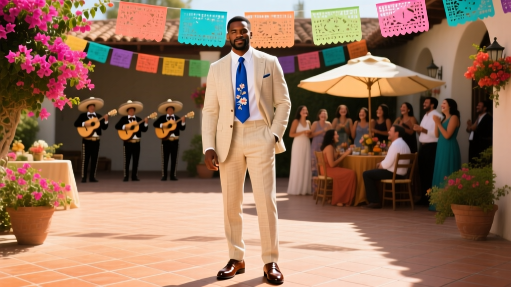 What to Wear to a Mexican Wedding Male: The Real-World Dress Code Guide (No More Guesswork, No Awkward Outfits, Just Confident Style That Fits the Fiesta)
 How Long Should a Wedding Dress Be in the Front? The Exact Measurements (Not Guesswork) That Prevent Tripping, Dragging, or Looking Unbalanced on Your Big Day — Plus Real Bride Photos & Alteration Pro Tips
 How Much Is a Typical Wedding Dress? The Real 2024 Price Breakdown (Spoiler: It’s Not $1,500—Here’s What 87% of Brides Actually Spend, Plus How to Save $1,200 Without Sacrificing Style)
 Can I Have My Wedding at an Airbnb? Yes—But Only If You Nail These 7 Non-Negotiables (Most Couples Miss #4)