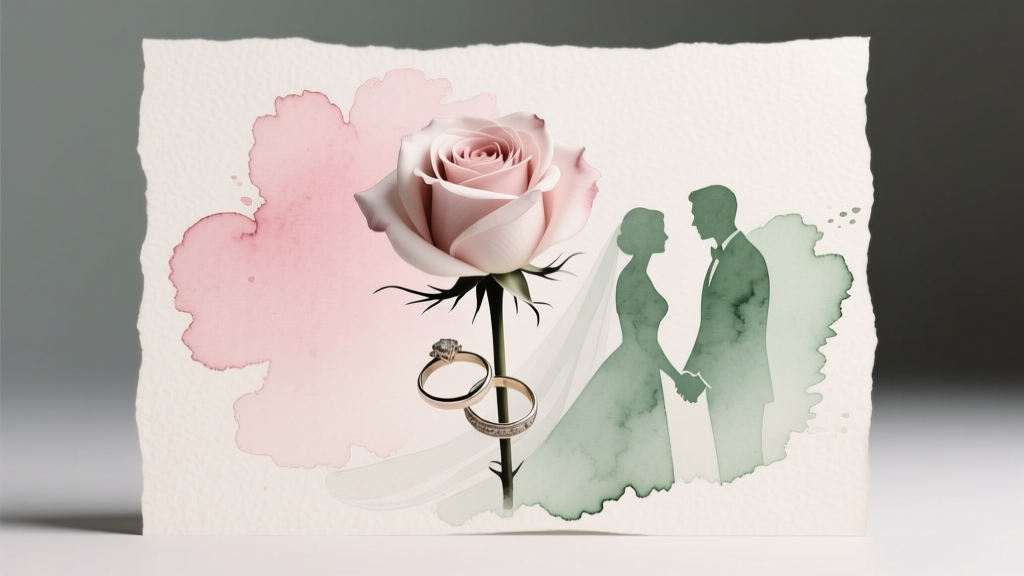
How to Execute a Watercolor Wedding Theme
A watercolor wedding theme feels like stepping into a living painting—soft washes of color drifting across linen, light catching translucent layers, florals that look freshly brushed onto the air. It’s romantic without being overly formal, artistic without feeling “theme-y,” and endlessly customizable for every season. Imagine your ceremony aisle lined with airy blooms in misty tones, menus printed with hand-painted edges, and a reception room glowing like sunset filtered through silk.
What makes watercolor wedding decor so captivating is its movement. Unlike high-contrast styles that rely on sharp lines, watercolor aesthetics thrive on gentle gradients, imperfect edges, and layered tones. This is why it photographs beautifully: the palette flatters skin tones, the details feel intentional up close, and from across the room the entire space reads as cohesive and luminous.
Designers love watercolor-inspired weddings because the concept can flex—from minimalist and modern to garden romantic and whimsical—without losing its signature softness. With a few smart design choices, you can create a wedding that feels curated, personal, and timeless.
Color Palette and Overall Aesthetic
Choose a “wash” palette, not a rainbow
The watercolor look works best when your colors feel blended rather than competing. Start with one primary “wash” color and two supporting tones, then add a neutral anchor.
- Romantic blush wash: blush, dusty rose, mauve, champagne + warm ivory
- Coastal watercolor: seafoam, pale aqua, slate blue + crisp white and sand
- Sunset ombré: peach, apricot, coral, soft terracotta + creamy beige
- Moody watercolor: smoky lavender, ink blue, muted plum + stone gray
- Botanical wash: sage, eucalyptus, pale olive + soft white and brushed gold
Current wedding trend data continues to point toward personalization and softer, nature-driven palettes—muted pastels, dusty tones, and organic textures remain popular because they feel elevated and photograph as “editorial” without being harsh. The watercolor theme aligns perfectly with that direction, especially when paired with tactile materials: raw silk ribbons, handmade paper, matte ceramics, and velvet accents.
Timeless design principle: repetition + restraint
Watercolor weddings shine when you repeat the same tones across multiple moments: invites, ceremony florals, tabletop linens, signature drink garnish, and signage. Keep one or two elements crisp (like black calligraphy or a clean white plate) so the soft color doesn’t blur into visual noise.
Venue and Setting Recommendations
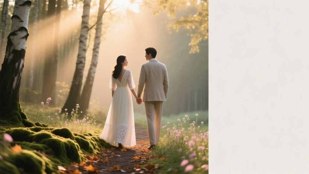
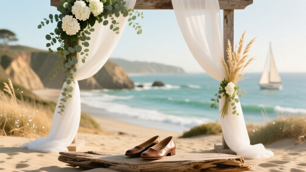
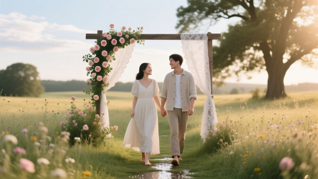
Best venue types for watercolor wedding aesthetics
- Garden venues and conservatories: Natural light intensifies watercolor translucency; greenery becomes your “canvas.”
- Art galleries and modern lofts: White walls + clean lines make watercolor accents pop while staying sophisticated.
- Vineyards and estates: Soft landscape hues echo watercolor gradients; ideal for sunset palettes.
- Coastal venues: Pair airy blues and sea-glass tones with driftwood textures and linen.
- Tented receptions: A sailcloth tent with bistro lights creates a glowing, diffused effect—exactly what watercolor wants.
If your venue is darker (ballroom, historic interior), you can still get the look—just add reflective surfaces (mirrors, glass votives), uplighting in a faint tint (think blush or lavender, not neon), and pale linens to lift the room.
Decor Elements That Make the Theme Feel Real
Centerpieces: layered, airy, and “painted”
Think of centerpieces as watercolor brushstrokes: light, dimensional, and varied in height. Try these actionable centerpiece formulas:
- Low meadow runners: A loose line of blooms and greenery down the center, dotted with bud vases. Add torn-edge place cards for that handmade feel.
- Clustered bud vases: Mix 5–9 small vessels per table (clear, milky glass, pale ceramic). Each holds a single stem or two in different tones.
- Floating “wash” candles: Pair taper candles in tonal shades (ombre from ivory to blush) with a simple floral accent near the base.
- Painter’s palette centerpiece: A neutral compote bowl with flowers arranged in color blocks that softly blend—peach fading into blush fading into cream.
Lighting: diffuse glow over spotlight drama
Watercolor decor needs flattering light. Aim for a gentle, enveloping atmosphere:
- Warm-white string lights overhead (especially in tents or patios)
- Clustered votives in clear and frosted glass for a “halo” effect
- Paper lanterns in soft white or pale blush to mimic floating pigment
- Subtle uplighting in a whisper of your palette tone (keep it very light)
Signage: watercolor edges + crisp typography
One of the easiest ways to sell the theme is through stationery-style decor. Use watercolor wedding signage in moments guests naturally pause:
- Welcome sign: Acrylic or handmade paper with watercolor wash corners and modern calligraphy.
- Seating chart: “Floating” cards on a mirror or linen board; each card has a soft painted swatch matching the table name.
- Bar sign: Watercolor illustrations of your signature cocktails (or painted fruit slices) for a playful touch.
Table settings: your canvas, your brushwork
Build the table like a layered painting:
- Linens: Ivory or pale stone tablecloths; add a gauzy runner in a tonal hue (raw silk or chiffon reads beautifully).
- Plates: White or lightly speckled stoneware keeps the look organic and timeless.
- Napkins: Hand-dyed ombré napkins or softly colored linen, tied with a thin ribbon and a sprig of herb.
- Place cards: Torn-edge paper with watercolor strokes; use a consistent brush style across the suite.
- Glassware: Clear with a delicate rim, or subtle tinted goblets in one shade (use sparingly).
Floral Arrangements and Botanical Elements
Florals that naturally mimic watercolor
Choose blooms that already look soft, petal-rich, and slightly translucent. Beautiful watercolor wedding flowers include:
- Garden roses, spray roses
- Ranunculus, anemones
- Peonies (seasonal favorite)
- Sweet peas, cosmos, butterfly ranunculus
- Delphinium, lilac, hydrangea (use hydrangea to create big “washes”)
Greenery and texture that keeps it grounded
To prevent watercolor palettes from feeling too sugary, add shape and texture:
- Eucalyptus and olive branches for soft movement
- Ferns for a painterly outline
- Herbs (rosemary, mint) for scent and styling
- Grasses or airy foliage for that “brushstroke” finish
Designer tip: ask your florist for color transitions—not “pink and blue,” but “blush fading into peach, with a hint of mauve.” That language gets you watercolor blending instead of color blocking.
Attire and Styling Suggestions
Wedding attire with watercolor romance
- Wedding dress: Look for tulle, organza, chiffon, or gowns with subtle floral appliqué—textures that echo translucency.
- Veil: A veil with scattered floral embroidery feels like petals drifting across a painted sky.
- Suiting: Soft neutrals (light gray, sand, muted blue) pair beautifully with watercolor palettes; add a textured tie or tonal boutonniere.
- Bridesmaid dresses: Mix-and-match in the same undertone (all warm or all cool). Consider ombré within your palette for a “gradient lineup.”
Beauty and accessories
Keep hair and makeup luminous and blended—think rosy cheeks, softly defined eyes, glossy lips. Accessories that suit the theme: pearl accents, delicate floral hair pins, watercolor-inspired enamel earrings, or a bouquet ribbon in hand-dyed silk.
Food, Drink, and Cake Ideas That Match the Theme
Signature drinks that look like a watercolor wash
- Lavender lemonade (pale purple, especially pretty in coupe glasses)
- Grapefruit rosé spritz (peach-pink glow with a citrus wheel)
- Cucumber mint gin fizz (a soft green tint, ultra refreshing)
- Butterfly pea tea mocktail that shifts color with citrus (a “live watercolor” moment)
Menus and plating
Lean into fresh, seasonal ingredients and colorful garnishes: edible flowers, microgreens, berry reductions, herb oils. For a practical touch, pair watercolor wedding menu cards with a clean typeface and plenty of whitespace—art plus readability.
Cake and desserts
Watercolor wedding cakes can be breathtaking without being overly fussy:
- Buttercream brushstrokes: Soft painted strokes around the tiers in your palette.
- Wafer paper ruffles: Translucent and airy, like layered paint.
- Pressed florals: A delicate, garden-art feel.
- Dessert bar: Macarons in ombré shades, berry tarts, and frosted sugar cookies with watercolor icing.
Budget Tips: Watercolor Style at Every Price Point
Low budget (smart swaps, high impact)
- Use bud vase clusters with grocery-store flowers (roses + eucalyptus goes a long way).
- Choose one statement sign (welcome or seating chart) and keep the rest simple.
- Rent neutral linens, then add color with napkins and paper goods.
- Print watercolor elements on standard cardstock but upgrade with torn edges or vellum overlays.
Mid-range (balanced designer look)
- Invest in a ceremony installation (a floral meadow or asymmetrical arch) and repurpose pieces at the sweetheart table.
- Add colored taper candles in tonal shades for instant ambiance.
- Upgrade paper goods with handmade paper for invitations or day-of stationery.
Luxury (immersive, editorial watercolor world)
- Commission custom watercolor artwork of your venue for invitations and signage.
- Create a painted dance floor border or monogram in soft gradient tones.
- Layer specialty linens (gauze runner over textured cloth) and add premium floral varieties like butterfly ranunculus and garden roses.
Real-World Inspiration Scenarios
Scenario 1: Backyard garden watercolor wedding
A sailcloth tent glows at dusk, with warm string lights overhead. Tables are dressed in ivory linens and blush gauze runners. Centerpieces are mismatched bud vases filled with peach ranunculus, white spray roses, and airy greenery. A hand-painted welcome sign leans against an old oak tree, and each place setting has a torn-edge watercolor place card topped with a rosemary sprig.
Scenario 2: Modern gallery watercolor wedding
White walls and polished concrete set a clean stage. You use a restrained palette—ink blue, smoky lavender, and ivory. Minimal floral arrangements sit in matte white vessels, while the stationery adds the “paint”: watercolor wash invitations, escort cards with soft gradients, and a bar sign with painted citrus and herbs. The result feels contemporary and artful, not overly sweet.
Scenario 3: Coastal watercolor wedding
A ceremony by the water features a simple arch wrapped in seafoam and white blooms. Reception tables include sand-toned linens, pale blue napkins, and clear glass votives that reflect the sunset. Signature cocktails arrive with salted rims and a tiny edible flower, like a final brushstroke.
Common Mistakes to Avoid
- Using too many colors: Watercolor should feel blended. Limit your palette and repeat it.
- Going too pale without contrast: Add a grounding neutral (stone, ivory, soft gray) and one crisp element (clean white plates or darker calligraphy).
- Overprinting watercolor everywhere: If every surface is painted, it stops feeling special. Choose hero moments—invites, signage, cake, or linens.
- Ignoring lighting: Cool, bright lighting can flatten watercolor tones. Aim for warm, diffused glow.
- Mismatch in undertones: Keep warm colors with warm metals (gold, champagne) and cool palettes with cool metals (silver, pewter). Mixed undertones can look accidental in photos.
Make the Watercolor Wedding Theme Yours
The most beautiful watercolor weddings don’t try to copy a single photo—they capture a feeling: soft light, layered color, and a sense of artfulness that still feels like you. Pick a palette that matches your season and venue, choose a few high-impact design moments, and let the rest breathe. When watercolor is done well, the day feels effortlessly romantic—like your love story rendered in light and color.
If you’re still exploring, keep the inspiration going with more wedding theme and decor ideas on weddingsift.com.
More Articles
 How to Create a Romantic Forest Edge Wedding Theme
 Monterey Wedding Theme Coastal California Charm
 Cottagecore Wedding Inspiration Countryside Romance
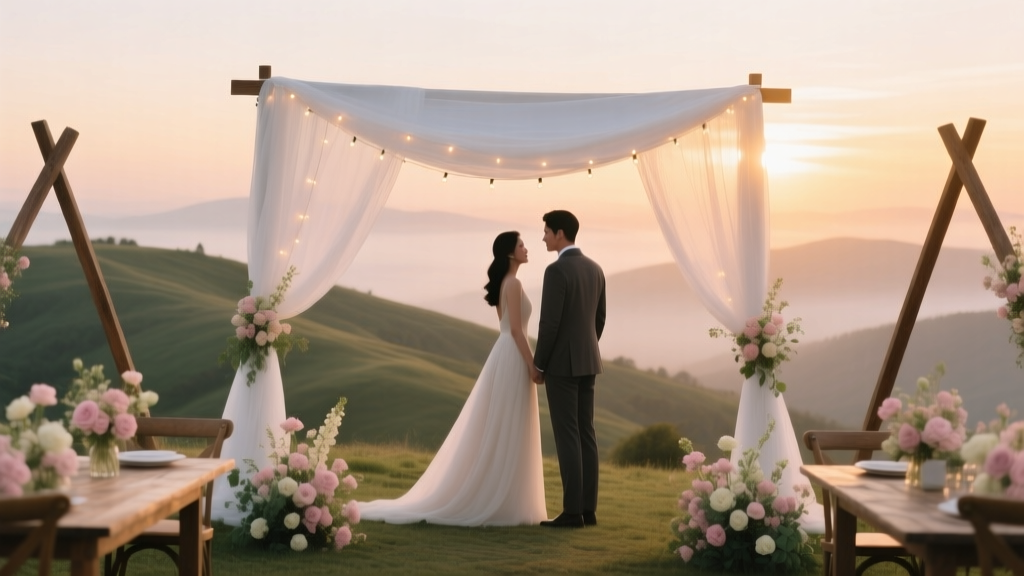 How to Create a Romantic Hilltop Wedding Theme
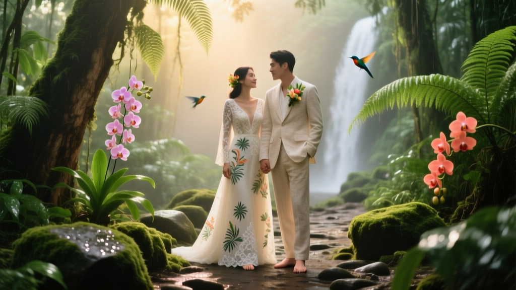 How to Plan a Tropical Rainforest Wedding
 Modern Glam Wedding Contemporary Sparkle and Shine
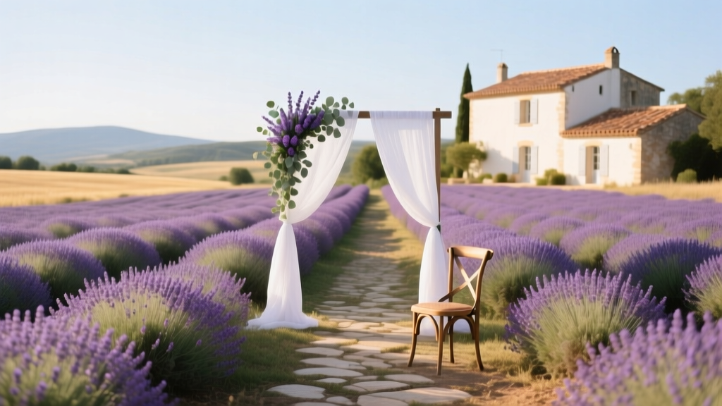 South of France Wedding Theme Lavender and Sunshine
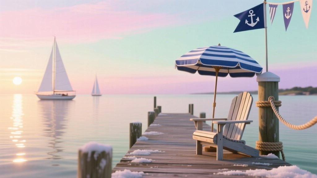 Cape Cod Wedding Theme Nautical New England
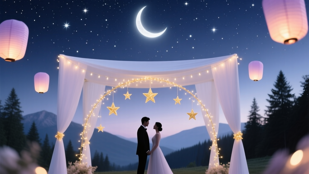 How to Plan a Celestial Starry Night Wedding
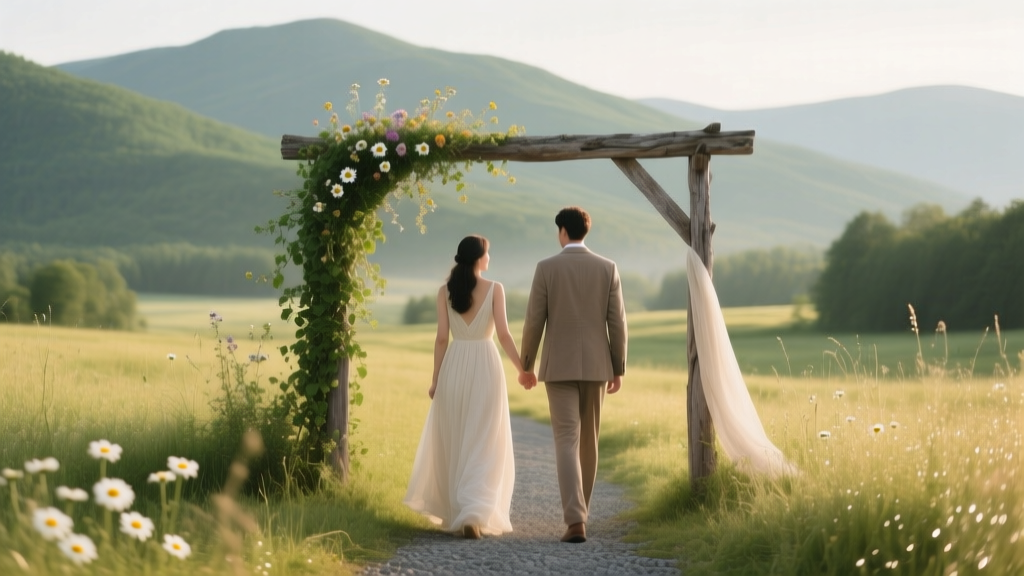 Green Mountains Wedding Theme Vermont Rustic Charm