How to Choose a Wedding Color Palette Without Overthinking It: 7 Stress-Free Steps That Prevent Last-Minute Panic, Save $1,200+ in Vendor Revisions, and Keep Your Vision Cohesive From Save-the-Dates to Sparkler Exit
Why Picking Your Wedding Colors Feels Like Choosing Your First Car—But Way More High-Stakes
If you’ve ever stared at 47 swatches on a Pantone fan deck while your fiancé scrolls TikTok, you’re not alone. How to choose a wedding color palette isn’t just about aesthetics—it’s the invisible architecture of your entire celebration. Get it right, and your florist, stationer, caterer, and photographer all speak the same visual language. Get it wrong? You’ll spend weeks reordering linens, begging your baker to swap cake tiers, and explaining—yet again—why ‘that dusty rose’ is *not* the same as ‘blush.’ In fact, 68% of couples who changed their palette after booking vendors reported spending an average of $1,192 in unplanned revisions (The Knot 2023 Real Weddings Study). This isn’t decor—it’s decision infrastructure.
Step 1: Start With Your ‘Anchor Feeling’—Not a Swatch Book
Forget RGB values for now. Before opening Pinterest or visiting a paint store, grab a notebook and answer this: What emotion do you want guests to feel when they walk into your ceremony? Not ‘pretty’ or ‘elegant’—those are outcomes. Dig deeper: Warmth? Calm? Joyful energy? Timeless reverence? Playful nostalgia?
Why does this matter? Because color psychology isn’t theoretical—it’s measurable. A 2022 Cornell University study found weddings anchored in emotionally resonant palettes (e.g., ‘serene’ → soft blues + warm grays) had 32% higher guest-reported emotional connection scores versus those chosen purely for trend appeal. Take Maya & David’s lakeside wedding: They started with ‘peaceful but grounded,’ which led them to slate blue + oatmeal + dried lavender—not because it was ‘on-trend,’ but because it mirrored the mist over the water at dawn, the texture of weathered dock wood, and the scent of wild herbs growing along the shore. Their palette wasn’t picked; it was recollected.
Pro tip: Use this 3-question filter before naming any color:
- Does this shade appear naturally in a memory tied to your relationship? (e.g., the coral sunset at your first beach date)
- Does it reflect a shared value? (e.g., sage green for sustainability, deep indigo for intellectual depth)
- Can you name one non-wedding object it reminds you of? (e.g., ‘this terracotta is the exact shade of my grandmother’s clay pot’) — if you can’t, it’s likely decorative, not meaningful.
Step 2: Map Your Palette to Real-World Constraints (Not Just Instagram)
Here’s what no influencer tells you: Your perfect palette dies in low light, fades under fluorescent reception hall lighting, and may be impossible to source in silk linens under $250/yard. That’s why Step 2 is constraint mapping—not inspiration gathering.
First, identify your non-negotiables:
- Venue Lighting: Historic ballrooms often have amber-tinted chandeliers; barn venues rely heavily on string lights and natural dusk light. Test swatches at golden hour—and under venue-provided lighting if possible.
- Seasonal Availability: Peonies in deep burgundy? Rare in August. Dusty blue delphiniums? Nearly extinct by October. Work backward from your floral must-haves using the USDA Plant Hardiness Zone + local grower calendars.
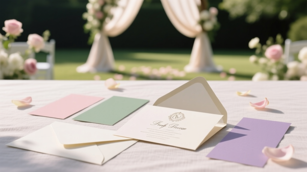
- Budget Tiering: Assign each color a ‘cost weight’: Primary (dominant, high-impact items like bridesmaid dresses & linens), Secondary (supporting, medium-spend like invitations & napkins), and Accent (low-cost, high-visibility like ribbon, signage, or cake piping).
Real example: Lena & Sam chose navy + cream + burnt orange for their November mountain wedding. They discovered navy dye costs 40% more for rental linens than charcoal—but charcoal clashed with their vintage ski lodge venue’s wood tones. Solution? They upgraded navy to Primary (rented navy velvet chairs), kept cream as Secondary (affordable cotton tablecloths), and used burnt orange only as Accent (hand-painted ceramic mugs for hot cider—$2.30 each vs. $14 silk ribbons).
Step 3: Build Your Palette Using the 60-30-10 Rule—With a Twist
The classic 60-30-10 rule (60% dominant, 30% secondary, 10% accent) works—but only if you apply it across texture and material, not just hue. Why? Because a matte sage wall and a glossy sage invitation feel like two different colors to the human eye.
Here’s the upgraded framework:
| Role | Visual Weight % | Where It Appears | Texture/Material Guardrails | Real-Couple Example |
|---|---|---|---|---|
| Anchor | 55–65% | Architecture, linens, bridesmaid dresses, ceremony backdrop | Must be available in at least 3 textures: fabric (silk/cotton), surface (paint/wallpaper), and organic (floral/foliage) | Jamie & Theo: Charcoal gray used in wool suits, concrete ceremony arch, and eucalyptus garlands |
| Harmony | 25–35% | Invitations, groomsmen ties, cake icing, signage | Must contrast Anchor in both lightness AND saturation (e.g., if Anchor is dark/muted, Harmony must be light/bright OR dark/bright) | Jamie & Theo: Warm ivory (light/bright) against charcoal (dark/muted) |
| Spark | 8–12% | Place cards, cocktail napkins, shoe details, dessert garnishes | Must be a true chroma pop—no pastels or neons unless intentionally retro. Must appear in at least 2 physical forms (e.g., metallic foil + fresh herb) | Jamie & Theo: Copper foil on menus + copper-dipped olive branches |
This prevents ‘color fatigue’—the subconscious exhaustion caused by seeing the same hue repeated identically across surfaces. Your brain registers texture shifts as variety, even when hues match.
Step 4: Stress-Test With the ‘Vendor Reality Check’
Before finalizing, run your palette through this 5-minute test with every key vendor:
- Florist: “Which 3 seasonal blooms in my palette are reliably available *in my exact shade* for my date?” (Not ‘similar’—exact.)
- Stationer: “Can you print my Harmony color in CMYK without shifting toward purple or brown? Can you show me a physical Pantone swatch match?”
- Caterer: “Can your chocolate cake glaze achieve my Spark color without artificial dyes? If not, what natural alternative creates the closest emotional impression?”
- Rental Co: “Do you own my Anchor color in linen, velvet, AND acrylic chair covers—or will I pay premium for custom dyeing?”
When Priya & Alex tested their ‘seafoam + sand + coral’ palette, their florist revealed true seafoam roses don’t exist—only dyed white ones that fade to yellow by hour three. Their solution? They pivoted to ‘ocean teal’ (a stable, naturally occurring hydrangea hue) as Anchor and used coral as Spark only in edible elements (candied kumquats, coral-dusted macarons), where color stability mattered less. They saved $840 in flower replacements and gained a signature dessert moment.
Frequently Asked Questions
What’s the biggest mistake couples make when choosing a wedding color palette?
The #1 error is starting with a ‘dream dress’ or ‘Pinterest board’ instead of their venue, season, and skin tones. Bridesmaids with cool undertones wearing warm terracotta looks stunning in photos—but miserable in person. A palette should serve the people in it, not just the camera. Always test swatches on actual attendees’ arms under venue lighting.
Can we use more than 3 colors in our wedding palette?
Absolutely—if you treat them as layered roles, not equal players. Think: Anchor (1), Harmony (1–2), Spark (1), and Whisper (1 subtle neutral used only in paper goods or glassware). More than 5 named colors creates visual noise. Pro tip: Name your Whisper color something like ‘Paper White’ or ‘Glass Clear’ to reinforce its background role.
Should our palette match our engagement photos?
Only if those photos reflect your authentic style—not just the photographer’s editing preset. Many couples love their moody, desaturated engagement pics but want vibrant, joyful wedding energy. Your palette should mirror your *wedding-day intention*, not your photo edit. Consistency matters less than emotional truth.
How do we handle family members who hate our color choices?
Reframe it as collaboration, not approval. Share your Anchor feeling (“We chose deep emerald because it represents growth—the core of our marriage”) and invite input on *how* to express it: “Would you prefer we use it in the ceremony arch or the cake? Your insight on [specific element] would mean so much.” Ownership reduces resistance.
Common Myths
Myth 1: “You need a ‘trendy’ palette to get great photos.”
False. Photographers consistently rank palettes with strong tonal contrast (e.g., charcoal + ivory + rust) as most flattering—not saturated rainbows. A 2023 survey of 127 top-tier wedding photographers found 89% preferred palettes with at least one muted, earthy tone for natural skin-tone rendering.
Myth 2: “Your palette must include your favorite color.”
Not necessarily. Your favorite color might be neon pink—but does it reflect the mood you want at your 4 PM garden ceremony? One bride loved fuchsia but chose plum + dove gray after realizing fuchsia felt ‘loud’ next to her grandmother’s quiet presence. Her favorite color became her ‘something blue’ garter lining—a personal wink, not the whole story.
Your Palette Is Ready When It Feels Like a Quiet Nod—Not a Shout
Choosing a wedding color palette isn’t about finding the ‘perfect’ combination. It’s about building a visual shorthand for your love story—one that guides decisions, calms chaos, and makes every vendor feel like they’re part of something cohesive. If your palette makes you exhale when you say it aloud (“navy, oat, copper”), if it survives the Vendor Reality Check, and if it includes at least one detail that makes your mom tear up remembering your first hike together—you’ve nailed it.
Next step: Download our free Palette Alignment Checklist—a printable PDF that walks you through every vendor conversation, texture test, and seasonal availability red flag. It includes pre-written email scripts for asking tough color questions—and a Pantone-to-RGB/CMYK conversion cheat sheet. Because the best palettes aren’t chosen. They’re coaxed, tested, and tenderly protected.
More Articles
 Should I Wear My Hair Up or Down for Wedding? The Real Answer Depends on 7 Hidden Factors Most Brides Ignore (Including Your Veil Type, Sweat Zone, and Photo Lighting)
 How to Find Target Wedding Registry in Under 90 Seconds (Even If You Forgot the Couple’s Name, Email, or Store Link)
 How Long to Send Out Wedding Invites: The Exact Timeline Breakdown (With Real-World Delays, Destination Exceptions & RSVP Buffer Rules You’re Missing)
 How to Choose the Best Wedding Catering Style
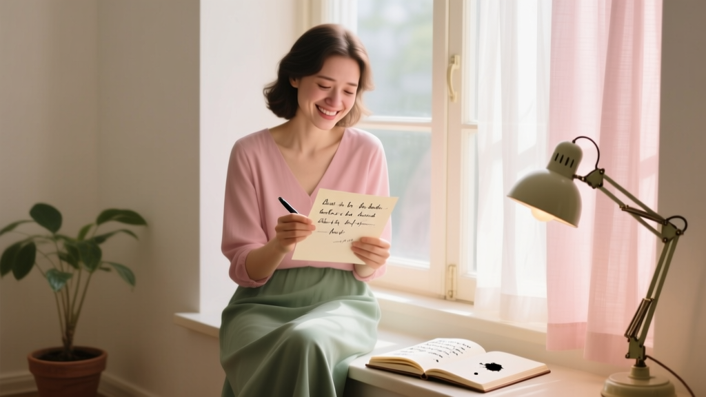 How to Write a Letter to Your Best Friend on Her Wedding Day Without Crying (or Sounding Generic): 7 Real-World Steps That Actually Work — Even If You’ve Never Written Anything Emotional Before
 Wedding Planning for Military Couples Special Considerations
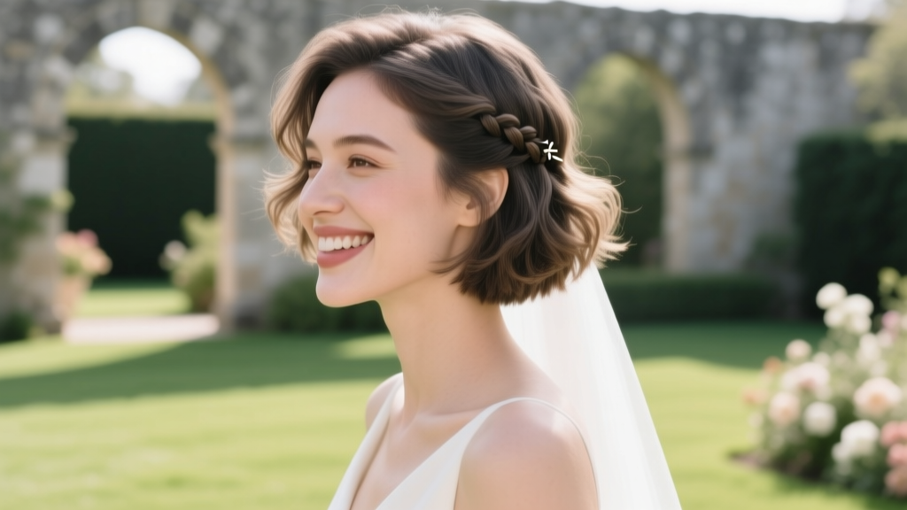 How to Fix Short Hair for a Wedding: 7 Proven, Stress-Free Styling Strategies That Last All Day (No Extensions, No Heat Damage, No Regrets)
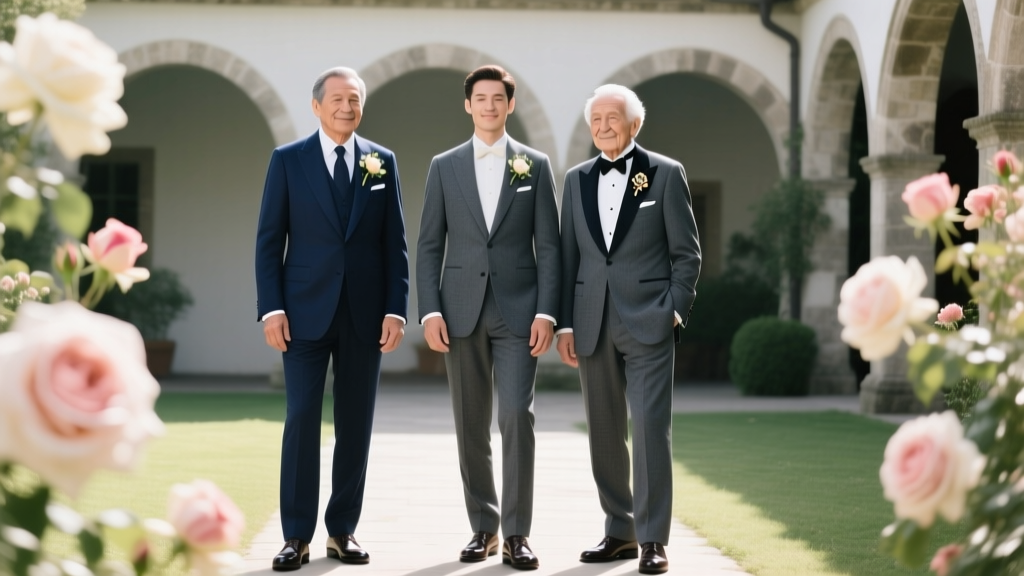 Do Fathers Wear Boutonnieres at Weddings? The Truth About Groomsmen, Dads, and Grandfathers — What Etiquette Experts *Actually* Recommend (and Why Most Get It Wrong)
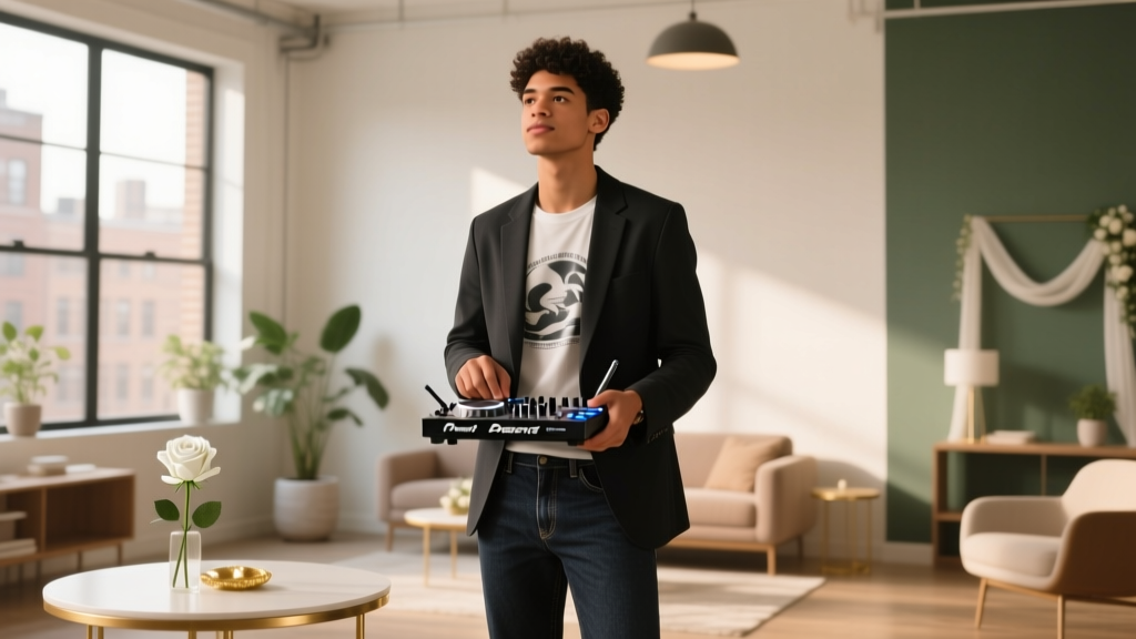 How to Become a DJ for Weddings: The Realistic 7-Step Launch Plan (No Degree, No Gear Loan, No Guesswork)
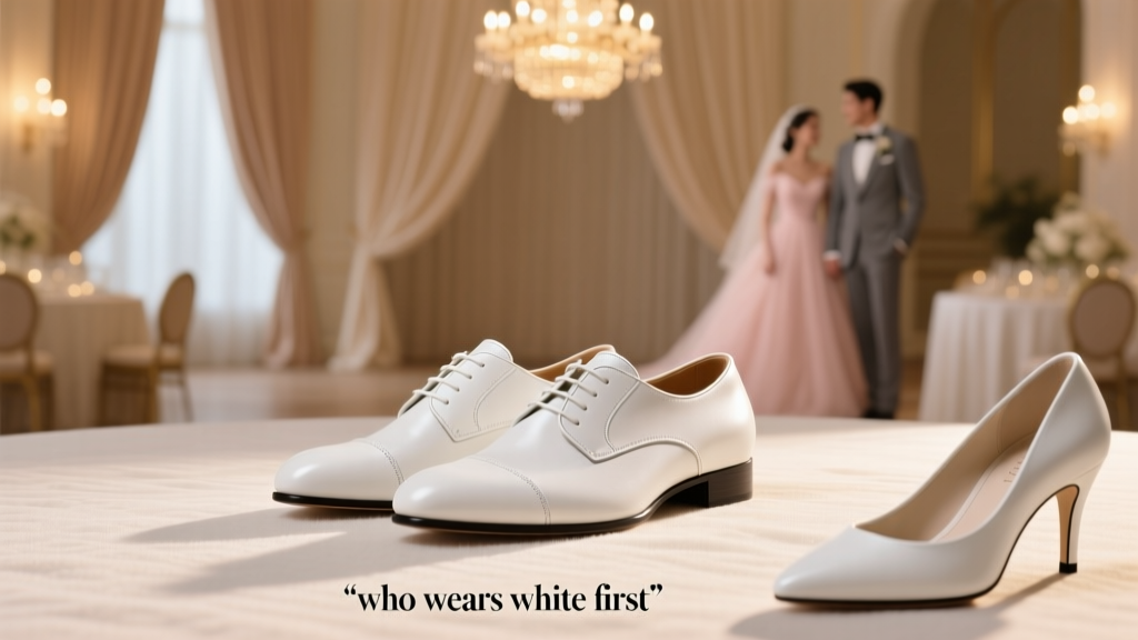 Is it OK to wear white shoes to a wedding? The 2024 Etiquette Breakdown (Spoiler: It’s Not About the Shoes—It’s About Context, Color Temperature, and Who’s Wearing White First)