What Color Do You Wear to a Wedding? The Real-World Dress Code Decoder (No More Awkward Guesswork or Last-Minute Panics)
Why Getting Your Wedding Guest Color Right Isn’t Just About Fashion — It’s About Respect, Confidence, and Zero Awkwardness
If you’ve ever stared into your closet at 3 p.m. the day before a wedding, clutching two dresses — one ivory, one blush — wondering, what color do you wear to a wedding?, you’re not overthinking. You’re navigating a high-stakes social code where a single hue can unintentionally upstage the couple, clash with cultural expectations, or even offend. In 2024, wedding etiquette has evolved far beyond ‘no white’ — it now includes seasonal palettes, destination-specific norms, dress code ambiguity (is ‘garden chic’ a color guideline or a vibe?), and rising awareness of inclusivity and neurodiversity in dress expectations. One misstep isn’t just fashion faux pas; it’s a subtle signal about whether you truly read the room — literally and emotionally. And with 78% of guests reporting stress over attire decisions (The Knot 2023 Guest Survey), this isn’t trivial. It’s emotional labor disguised as sartorial choice.
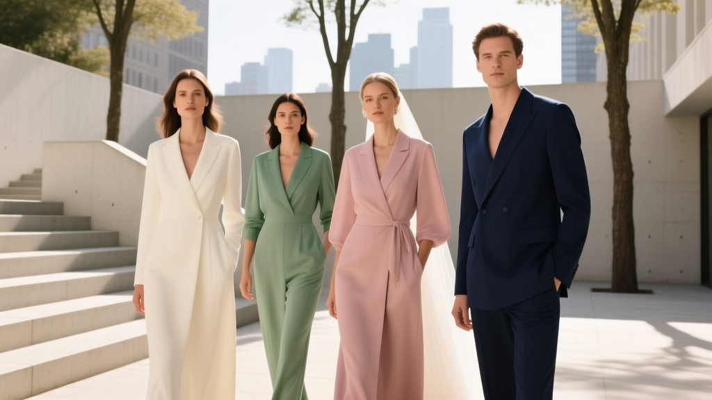
Your Wedding Guest Color Decision Is Actually a 4-Layer Puzzle
Choosing what color to wear isn’t about picking your favorite shade — it’s solving a layered contextual puzzle. Let’s break down each layer with real-world examples and actionable filters:
Layer 1: Decode the Invitation — Beyond ‘Black Tie’
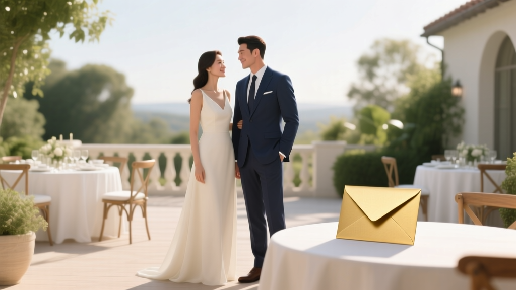
Most guests stop reading after ‘cocktail attire’ — but the real clues hide in the wording, font, paper stock, and even the RSVP deadline. A gold-foil invitation with botanical illustrations and a May date strongly implies soft pastels or earthy tones (think sage, terracotta, dusty rose). A minimalist black-and-white invite with a December date? Deep jewel tones or charcoal grays are safer bets. Crucially, look for *explicit color guidance*: some modern couples include a palette swatch or note like ‘We love muted tones — please avoid neon or metallics.’ If they’ve shared their wedding website, scroll to the ‘Attire’ tab — 62% of couples now add detailed color notes there (WeddingWire 2024 Data Report).
Layer 2: Map the Venue & Time — Your Color Compass
A beach ceremony at sunset demands different hues than a cathedral wedding at noon. Light refracts differently, fabrics behave differently, and cultural associations shift. Consider this real example: Maya, a guest at a 4 p.m. vineyard wedding in Napa, wore a bold cobalt blue jumpsuit — stunning in photos, but she later learned the couple had requested ‘warm, sun-kissed tones’ to harmonize with golden-hour lighting and amber-hued architecture. Her color wasn’t ‘wrong,’ but it disrupted visual cohesion. Here’s how to calibrate:
- Outdoor daytime (garden, beach, park): Lean into airy, reflective colors — sky blue, seafoam, butter yellow, lavender. Avoid stark white (washes you out) and heavy black (absorbs heat, looks severe).
- Indoor evening (ballroom, historic hotel): Rich, saturated tones shine — emerald, burgundy, navy, plum. Metallic accents (gold, bronze) are welcome if subtle.
- Religious venues (churches, temples, mosques): Prioritize modesty-aligned hues — deep teals, forest greens, charcoal. Avoid sheer fabrics or overly bright neons that distract from sacred space.
- Destination weddings (Mexico, Greece, Bali): Honor local aesthetics — avoid culturally inappropriate shades (e.g., wearing all-white in parts of India where it signifies mourning; wearing red in some Southeast Asian contexts without understanding its celebratory weight).
The Forbidden Colors — And Why ‘No White’ Is Just the Tip of the Iceberg
Yes, traditional etiquette says ‘no white’ — but that’s outdated shorthand. What’s actually off-limits depends on *why* white is restricted: to preserve the bride’s spotlight and symbolic uniqueness. So the real rule isn’t ‘no white’ — it’s ‘no bridal-adjacent hues.’ That includes:
- Ivory, champagne, eggshell, lace-white, and off-white — all visually compete with most bridal gowns.
- Light blush or pale pink — dangerously close to ‘blush’ wedding dresses, especially in natural light.
- Sparkly silver or mirror-finish metallics — mimic bridal veils or gown details.
- Full-head-to-toe black at daytime weddings — still reads as funereal in many Western contexts (though increasingly accepted for evening events).
But here’s the twist: In 2024, 41% of couples *invite* guests to wear specific colors — often coordinating with their palette. One couple in Asheville asked guests to wear ‘anything in the mountain palette’: slate gray, moss green, or burnt sienna. Their wedding photos looked like a living painting. So ‘forbidden’ isn’t universal — it’s relational. Always cross-check with the couple’s stated wishes.
Color Psychology Meets Wedding Guest Strategy
Your color choice subtly broadcasts your role and energy. Neuroscience research (Journal of Consumer Psychology, 2022) confirms color primes perception: guests in warm tones (coral, rust, amber) are perceived as more approachable and joyful; those in cool tones (navy, slate, lavender) read as calm and composed. At a high-energy, dance-heavy reception? A vibrant coral dress signals ‘I’m here to celebrate.’ At a quiet, intimate ceremony honoring a grieving parent? A deep teal conveys reverence without somberness. Consider these strategic pairings:
“At my cousin’s micro-wedding in Kyoto, I wore indigo-dyed silk — respectful of Japanese textile tradition, calming for the Zen garden setting, and rich enough to photograph beautifully against maple trees. No one mentioned my outfit — which meant I’d nailed the unspoken assignment.” — Lena, guest, October 2023
| Color Family | Best For | When to Avoid | Pro Styling Tip |
|---|---|---|---|
| Neutrals (charcoal, taupe, camel) | Formal indoor weddings, winter ceremonies, religious venues | Beach or garden weddings (can look washed out or dull in bright light) | Add dimension with textured fabric (wool crepe, bouclé) or a bold clutch (ruby red or cobalt) |
| Earth Tones (terracotta, olive, rust) | Fall weddings, rustic venues, destination weddings in natural settings | Modern urban lofts or ultra-minimalist ceremonies (can feel ‘too organic’) | Pair with matte gold jewelry — avoids ‘costume’ effect |
| Pastels (mint, lilac, peach) | Spring garden weddings, daytime celebrations, baby or gender-reveal adjacent events | Evening black-tie, formal religious services, or weddings with ‘moody’ palettes | Opt for satin or silk — cotton pastels can look juvenile |
| Jewel Tones (emerald, sapphire, amethyst) | Evening receptions, historic venues, winter holidays, cultural celebrations | Very young children’s weddings (may overwhelm) or ultra-casual backyard BBQs | Keep accessories minimal — let the color speak |
| Monochrome (head-to-toe navy, black, or gray) | Urban weddings, corporate-adjacent couples, modern minimalist themes | Daytime outdoor weddings (heat absorption + visual heaviness) | Add interest via cut (wide-leg pant, asymmetrical hem) or fabric drape |
Frequently Asked Questions
Can I wear black to a wedding?
Yes — but context is everything. Black is widely accepted for evening weddings, especially in cities or modern/industrial venues. However, avoid head-to-toe black at daytime ceremonies, religious services, or cultures where black signifies mourning (e.g., parts of Latin America, East Asia, or Orthodox Jewish traditions). When in doubt, opt for charcoal, deep navy, or black paired with a colorful scarf or statement earrings to soften the tone.
Is it okay to wear the same color as the bridesmaids?
Generally, yes — unless the couple has explicitly asked guests to avoid it. Bridesmaid colors are chosen for harmony, not exclusivity. That said, match the *tone*, not the exact shade: if they’re in dusty rose, wear mauve or raspberry — not identical Pantone 13-1404 TPX. Pro tip: Check the wedding website or ask the couple directly if unsure. One guest wore the exact bridesmaid color and was warmly welcomed — because she’d confirmed it first.
What if the couple didn’t specify a dress code?
Default to ‘cocktail attire’ and choose a color that’s polished but not overpowering: navy, burgundy, forest green, or deep plum. Then, do reconnaissance: check their engagement photos (are they outdoorsy? Urban? Vintage-loving?) and social media (do they post warm tones or moody aesthetics?). If attending with a plus-one, coordinate hues — e.g., one in rust, one in cream — rather than matching exactly. When uncertain, understate rather than overstate.
Can I wear floral prints — and does the background color count as my ‘main’ color?
Absolutely — florals are timeless wedding guest choices. Your dominant color is the one that occupies >50% of the garment’s surface area or the boldest hue in the print. So a navy dress with white florals = navy. A blush dress with navy florals = blush. Avoid prints where white dominates — even if it’s ‘just the background,’ it risks competing with the bride. Also, steer clear of oversized, cartoonish florals at formal events; opt for painterly, watercolor, or vintage-inspired motifs instead.
Do cultural backgrounds change the rules?
Significantly. In Hindu weddings, guests often wear bright, auspicious colors like red, gold, or saffron — white is traditionally avoided (associated with mourning). In Chinese weddings, red symbolizes luck and joy; black and white are generally discouraged unless balanced with red accents. In Nigerian Yoruba ceremonies, Ankara prints in vibrant, symbolic colors are celebrated. Always ask the couple or a culturally fluent friend — never assume. One guest wore ivory to a Ghanaian wedding and was gently redirected to ‘please choose something with kente-inspired gold’ — a moment of learning, not shame.
Debunking 2 Persistent Wedding Color Myths
Myth #1: “You must never wear red to a wedding.”
Reality: Red is deeply auspicious in Indian, Chinese, Mexican, and many African weddings — and increasingly embraced globally as bold, confident, and celebratory. The taboo stems from outdated Western assumptions about ‘attention-grabbing.’ If the couple loves red, wearing it shows you honor their taste. Just avoid fire-engine red at a monochromatic gray-and-ivory wedding — context, again, is king.
Myth #2: “Pastels are only for spring — and always look ‘cheap’.”
Reality: Modern pastels (think: clay pink, oat milk, sage) in luxe fabrics (silk charmeuse, double-faced wool) read as sophisticated, not saccharine. They’re ideal for spring *and* summer, and even work in fall when layered with camel coats or leather jackets. The ‘cheap’ perception comes from polyester blends and poor tailoring — not the hue itself.
Your Next Step: Build Your Color Confidence — Not Just Your Outfit
Choosing what color to wear to a wedding isn’t about memorizing rules — it’s about cultivating situational awareness, empathy, and intentionality. You now know how to decode invitations, map venues, leverage color psychology, and navigate cultural nuance. So don’t just pick a dress — pick a color that says, ‘I see you, I respect your day, and I’m here to celebrate *your* love story — not my own aesthetic.’
Your action step today: Open your calendar, find your next wedding invite, and spend 90 seconds doing this: (1) Circle any color or style hints on the invite, (2) Google the venue’s exterior photos, (3) Check the couple’s wedding website ‘Attire’ page — then text them one question: ‘Would you like guests to lean into warm or cool tones?’ Nine times out of ten, they’ll reply with gratitude — and you’ll have your answer, no guesswork required.
More Articles
 How Do You Tip Wedding Vendors? The Real-World Guide That Prevents Awkwardness, Saves You Money on Gratuity Overages, and Keeps Your Day Running Smoothly (No More Last-Minute Panic)
 How Much Does It Cost to Feed 150 Wedding Guests? (Spoiler: It’s Not $30–$40 Per Person Anymore — Here’s the Real 2024 Breakdown by Service Style, Cuisine, & Location)
 How to Have a Cheap But Classy Wedding: 7 Realistic Strategies That Save $8,200+ Without Sacrificing Elegance (Backed by 127 Real Couples’ Budgets)
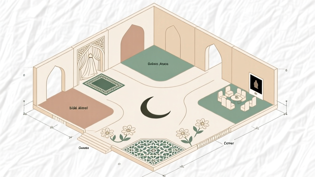 How to Draw a Muslim Wedding: A Step-by-Step Minimal Checklist (No Art Skills Needed) That Helps You Visualize Venue Flow, Cultural Zones & Guest Experience in Under 90 Minutes
 How to Save Money for Your Wedding: 7 Realistic, Stress-Free Strategies That Cut Costs by 30–50% Without Sacrificing Meaning (Backed by 127 Couples’ Data)
 Can I Wear Chinos to a Wedding? The Real Answer (Spoiler: Yes—But Only If You Nail These 5 Critical Details First)
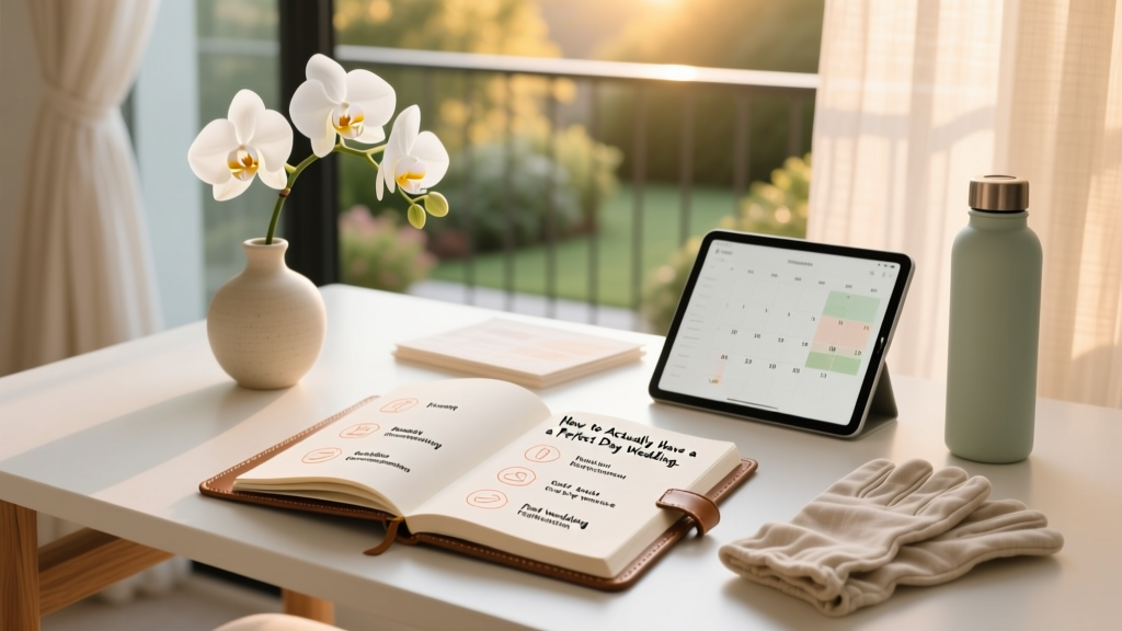
 How to Make Your Own Wedding Planner: A Stress-Free, Step-by-Step System That Saves $3,200+ (Without Hiring a Pro or Losing Your Sanity)
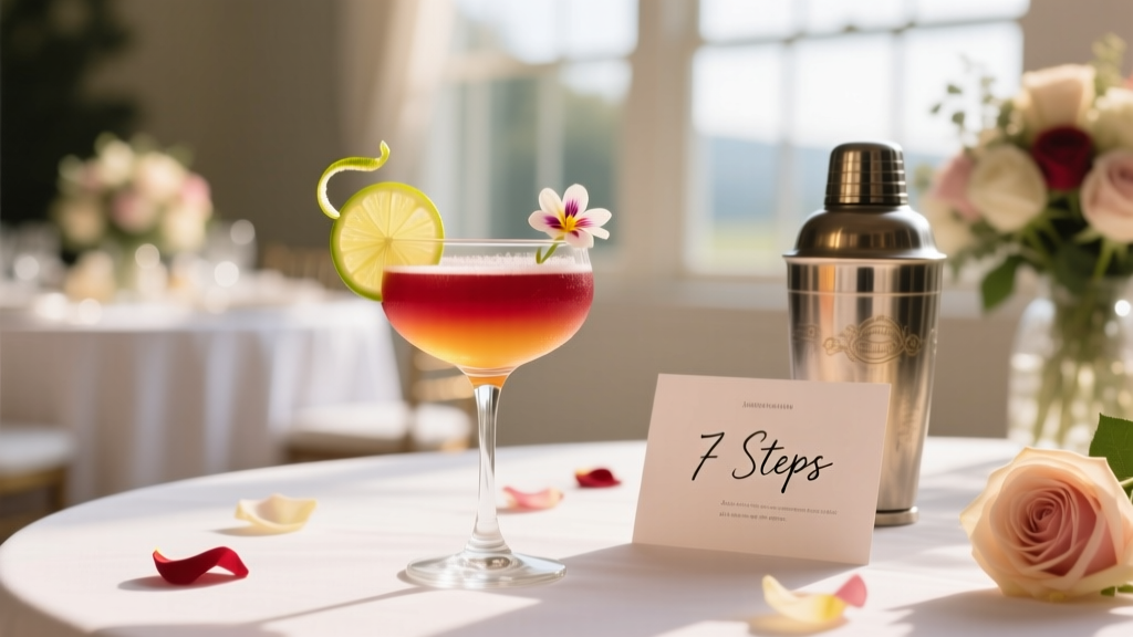 How to Create a Signature Cocktail for Wedding: 7 Stress-Free Steps That Take Less Than 90 Minutes (No Bartending Degree Required)
 How to Actually Have a Perfect Day Wedding (Without Burnout, Budget Blowouts, or Last-Minute Panic) — A Realistic 7-Step Framework Backed by 127 Couples’ Post-Wedding Surveys
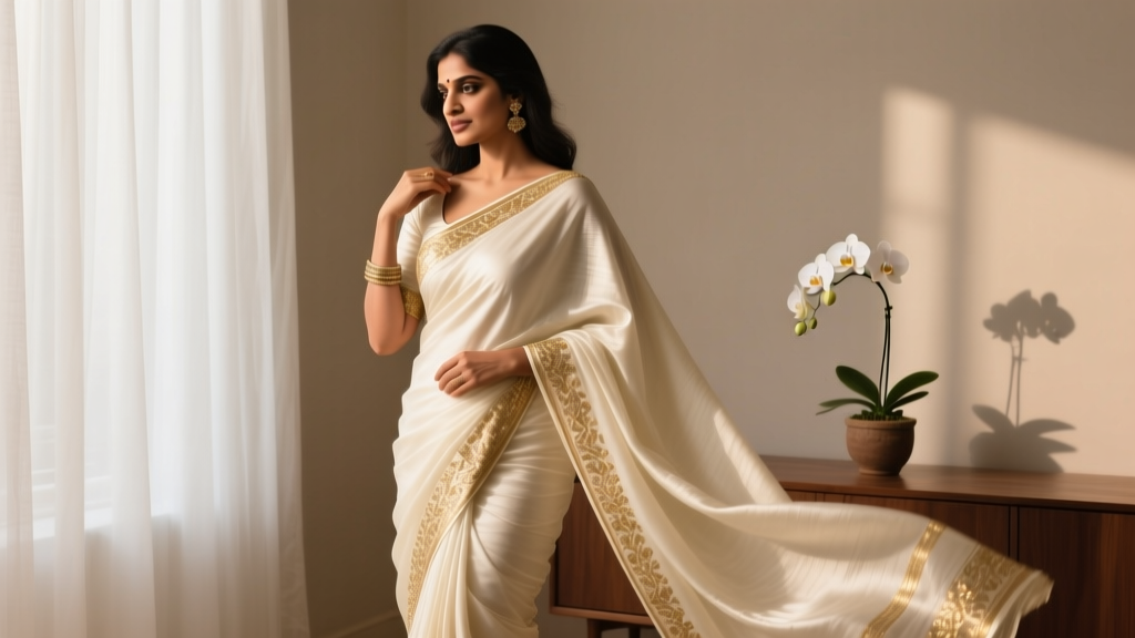 How to Wear Saree for Wedding Party: 7 Stress-Free Steps Even First-Timers Nail (No Draping Panic, No Last-Minute Fixes, Just Confident Elegance)