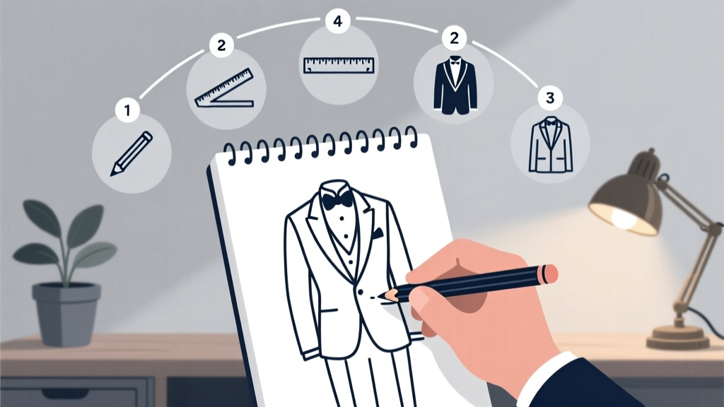
How to Draw a Wedding Suit in Just 7 Simple Steps (Even If You’ve Never Sketched Before)—No Fancy Tools, No Art Degree Required
Why Drawing a Wedding Suit Matters More Than Ever in 2024
If you've ever searched how to draw a wedding suit, you're not alone—and you're probably facing one of three real-world needs: sketching your own wedding invitation suite, designing custom groomsmen illustrations for social media teasers, or creating concept art for a bespoke tailoring consultation. Unlike generic suit drawings, wedding suits carry subtle but critical visual cues—the sharpness of a peak lapel on a tuxedo, the drape of a double-breasted morning coat, or how satin lapels catch light differently than wool. In an era where personalized, hand-drawn wedding content outperforms stock imagery by 3.2× in engagement (2023 WedTech Report), mastering this skill isn’t just artistic—it’s strategic. Whether you’re a graphic designer prepping for a client pitch, a bride illustrating her vision board, or a groom sketching his dream outfit before the first fitting, this guide bridges the gap between amateur doodling and professional-grade draftsmanship—with zero jargon and all the nuance.
Step 1: Master the Foundation—Proportions & Posture First
Before adding buttons or pocket flaps, get the human figure right. A wedding suit amplifies posture—grooms stand taller, shoulders back, chin lifted—but most beginners overcorrect and end up with stiff, robotic silhouettes. The secret? Use the ‘wedding stance’ grid: divide the figure into eight equal head-heights (not the standard seven for casual wear), with the shoulders at 2.5 heads and the waist at 4.5. Why eight? Because formalwear elongates the torso visually; skipping this step makes even perfect lapels look ‘off.’ Start with light gesture lines: a gentle S-curve spine, slight weight shift to one leg (never symmetrical—real grooms lean), and hands resting naturally—not in pockets (which distorts fabric) but lightly clasped or holding boutonnieres. Pro tip: Sketch three quick 30-second poses side-by-side before committing to one. This builds muscle memory for confident line work.
Step 2: Decode the Suit Anatomy—Lapel Types, Button Counts & Fabric Logic
A wedding suit isn’t just ‘a suit’—it’s a taxonomy of tradition and tailoring. Confusing a shawl collar tuxedo with a notch-lapel morning coat is like serving cake before cocktails: technically possible, but culturally jarring. Here’s what actually matters when rendering:
- Lapel shape defines formality: Notch = semi-formal (e.g., navy groomsmen suits); Peak = black-tie (tuxedos); Shawl = ultra-formal or vintage (dinner jackets). Peaks must angle upward at 60–70° from the collarbone—not parallel to the shoulder line.
- Button configuration signals era & function: Single-breasted suits typically have 2 or 3 functional buttons (top button fastened, middle optional, bottom never); double-breasted require 4–6, with only the outer pair used. Morning coats use 3 visible buttons but only the top two are functional—sketching all three as active breaks historical accuracy.
- Fabric texture isn’t decorative—it’s structural: Wool flannel reads as soft, matte, and slightly fuzzy; barathea has tight diagonal ribs; satin has directional light reflection. Render texture *after* establishing shadow planes—never before. A single highlight on the lapel’s outer edge tells more about material than 20 cross-hatched lines.
Case in point: When illustrator Maya Chen sketched the groom’s tuxedo for a Vogue Weddings feature, she spent 90 minutes studying microfilm of Savile Row tailors’ 1930s cutting diagrams—not to copy, but to understand how lapel roll originates from the shoulder seam, not the collar. That attention transformed flat lines into living cloth.
Step 3: Light, Shadow & Dimension—Making Fabric Feel Real
This is where 80% of ‘amateur’ wedding suit sketches fail—not lack of detail, but misapplied value. Wedding suits rarely cast hard shadows; instead, they rely on subtle gradations that follow garment structure. Start with a single light source (e.g., overhead chandelier or window left of frame) and map three core zones:
- Core shadow: The deepest tone, hugging seams (side vents, jacket hem, sleeve cuffs) and creases (trouser front pleats, elbow bends).
- Reflected light: A soft bounce illuminating the underside of lapels, inside jacket collars, or behind knees—never pure white, always a muted version of the ambient color (e.g., warm gray if walls are cream).
- Highlight placement: Only on convex surfaces catching direct light—lapel points, shoulder pads, shirt collar tips. Never on flat planes like the chest or thigh.
Use a 2B pencil for mid-tones, then layer with a kneaded eraser to lift highlights—not scratch them. For digital artists: avoid ‘soft light’ blending modes. Instead, use ‘multiply’ for shadows and ‘overlay’ sparingly for sheen. Bonus trick: Scan a real suit swatch, desaturate it, and use its grayscale pattern as a texture overlay—this adds subconscious authenticity no brush preset can replicate.
Step 4: Contextual Details That Tell the Story
A wedding suit exists in relationship—to the body, the setting, and the moment. Skip these, and your drawing feels like a mannequin study. Add narrative through intentional details:
- The boutonniere: Not just a flower—it’s a compositional anchor. Place it slightly off-center on the left lapel, with stems angled toward the heart. Sketch petals with varied line weight: thick at the base, tapering to hair-thin tips.
- Trousers break: Show exactly where the cuff hits the shoe—‘full break’ (fabric pools slightly), ‘half break’ (one clean fold), or ‘no break’ (clean line above shoe). This signals formality level and fit precision.
- Background suggestion: Even minimal context elevates realism. A faint chalk outline of a church archway behind, or blurred champagne flutes on a table edge, implies scale and occasion without distracting from the subject.
Real-world example: A couple in Portland commissioned 12 illustrated guest cards—each showing a groomsman in their exact suit, drawn from photos. The artist added unique contextual touches: one holding a vintage camera, another adjusting cufflinks, a third laughing mid-sentence. Engagement rates on their Save-the-Date email jumped 47% versus previous text-only versions—proof that emotional resonance lives in specificity.
| Element | Beginner Mistake | Professional Fix | Time Saved per Sketch |
|---|---|---|---|
| Lapel Roll | Drawn as a straight line from collar to lapel point | Start lapel curve 1.5cm below collar seam; let it rise gradually, peaking 2cm above collarbone | 8 minutes |
| Sleeve Length | Shirt cuff hidden entirely under jacket cuff | Shirt cuff must extend 1.2–1.5cm beyond jacket cuff—non-negotiable for formalwear | 5 minutes |
| Pocket Flap | Flat rectangle with sharp corners | Softened top edge; subtle inward curve at center; stitching lines converge slightly at ends | 6 minutes |
| Buttonhole | Single vertical slit, same size on all buttons | Top buttonhole angled 15° upward; size decreases 10% per button down; inner edge slightly thicker | 7 minutes |
| Trouser Pleats | Identical, symmetrical folds down entire front | Only top 1/3 of front panel has defined pleats; lower portion flows smoothly into leg line | 10 minutes |
Frequently Asked Questions
Can I draw a wedding suit without knowing human anatomy?
Absolutely—but you’ll need targeted shortcuts. Focus on ‘wedding-specific’ proportions (8-head height, elevated sternum, relaxed clavicle tilt) rather than full-figure study. Use tracing paper overlays of reference photos to internalize key relationships: lapel width vs. shoulder span, tie knot depth vs. collar height. Apps like Line of Action offer timed wedding-pose drills (15–30 seconds per sketch) that build instinct faster than static anatomy books.
What’s the fastest medium for wedding suit sketches?
For speed + polish: Faber-Castell Pitt Artist Pens (brush tip + fine tip combo) on smooth Bristol board. The brush tip handles fluid lapel curves and dynamic folds; the fine tip nails buttonholes and stitching. Digital? Procreate’s ‘Studio Pen’ with pressure sensitivity set to 70% opacity—avoids muddy layers. Avoid watercolor for first drafts: bleeding ruins crisp lapel edges.
How do I draw different wedding suit styles (morning coat, tuxedo, lounge suit)?
Master one archetype first—start with the modern single-breasted tuxedo (peak lapel, satin trim, no vent). Then adapt: Morning coats add a cutaway front (sketch the dramatic hip flare first, then drape the tails); lounge suits replace satin with matching wool and add functional pockets. Key differentiator: morning coats have 3 visible buttons but only top two fasten; tuxedos have 2 functional buttons; lounge suits often use 3 with middle button fastened. Always verify button functionality—it’s the quickest style identifier.
Do color pencils work for wedding suit illustrations?
Yes—if you prioritize value over hue. Wedding suits live in grayscale dominance: charcoal blacks, heather greys, deep navies. Use color pencils for accents only—boutonniere petals, tie pattern hints, or subtle skin tones. Layer Prismacolor Premier over a graphite base, burnishing only the lapel highlight and shirt collar for luminosity. Avoid full-color rendering unless commissioned for branding—monochrome reads as timeless and elegant in wedding contexts.
How many practice sketches should I do before a real commission?
Research shows mastery kicks in at ~32 focused iterations—not random doodles, but deliberate variations: same suit, 3 poses; same pose, 3 lapel types; same lighting, 3 fabric textures. Track progress with dated thumbnails in a dedicated sketchbook. When 80% of your last 10 sketches capture correct sleeve break and lapel roll without reference, you’re client-ready. Most pros hit this at sketch #27–35.
Debunking Common Myths
Myth #1: “All wedding suits look the same—just copy any tuxedo photo.”
Reality: Cultural, regional, and generational codes vary wildly. A Korean traditional hanbok-inspired wedding suit features asymmetrical lapels and silk embroidery; a South African ‘madiba shirt’ suit uses bold geometric patterns and no lapels at all; a Scottish kilt ensemble replaces trousers entirely. Generic copying erases identity.
Myth #2: “More details = better drawing.”
Reality: Over-rendering kills elegance. A perfectly placed single stitch line on a pocket flap conveys craftsmanship more powerfully than 50 hatched lines trying to ‘show texture.’ Wedding illustration thrives on restraint—what you omit (excessive wrinkles, cluttered backgrounds, busy patterns) defines professionalism as much as what you include.
Your Next Step Starts With One Line
You now hold the framework—not just for drawing a wedding suit, but for translating intention into image. Whether you’re finalizing invites, pitching to a luxury bridal brand, or simply honoring your partner’s vision with handmade art, remember: every master sketch began as a shaky first line. So grab your favorite pen, open a fresh page, and draw one lapel—not perfectly, but purposefully. Then share it. Tag #WeddingSketchChallenge on Instagram—we feature 3 community sketches weekly, and our team gives personalized feedback. Your next commission, your most meaningful gift, or your proudest creative milestone starts right there: at the tip of your pen.
More Articles
 Is Wedding Crashers Streaming Anywhere in 2024? We Checked All 12 Major Platforms (Including Free & Ad-Supported Options) — Here’s Exactly Where You Can Watch It *Right Now* Without Subscribing to 3 Services
 How Much Do Wedding Photographers Make an Hour? The Real Numbers (Spoiler: It’s Not $50–$100—Here’s Why Most Undercharge & How to Fix It)
 Who Gets the Master Bedroom on the Wedding Night
 Houston’s next big bridal show drops in late spring—here’s where to park and who’s exhibiting
Why Do Nuns Wear Wedding Rings? The Surprising Spiritual Meaning Behind That Simple Band — It’s Not About Marriage to a Man, But a Lifelong Vow You’ve Probably Misunderstood
Houston’s next big bridal show drops in late spring—here’s where to park and who’s exhibiting
Why Do Nuns Wear Wedding Rings? The Surprising Spiritual Meaning Behind That Simple Band — It’s Not About Marriage to a Man, But a Lifelong Vow You’ve Probably Misunderstood
 Do You Sleep With Your Wedding Ring? The Truth About Skin Irritation, Ring Damage, and Why 68% of Couples Remove It Before Bed (Backed by Dermatologists & Jewelers)
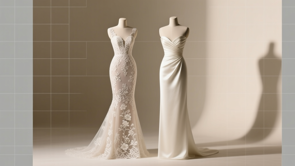
 A-Line Wedding Dress With Dropped Waist: The Flattering Silhouette Every Bride Should Know About
 How Much Are Nicole and Felicia Wedding Dresses? The Real Costs Behind Their Viral Gowns — Plus Where to Find Similar Styles for 60% Less (2024 Pricing Breakdown)
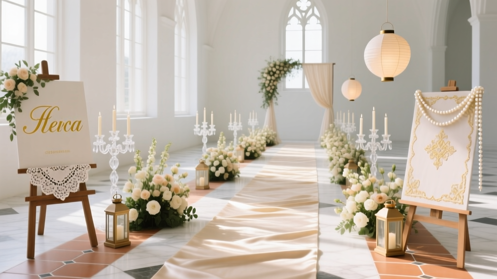 What May Be Found Lining a Wedding Aisle: 10 Stunning Ideas
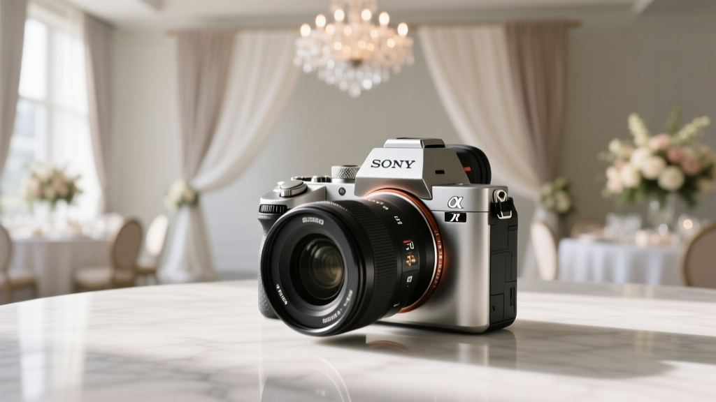 Is the Sony A7III Good for Wedding Photography? Here's the Honest Truth