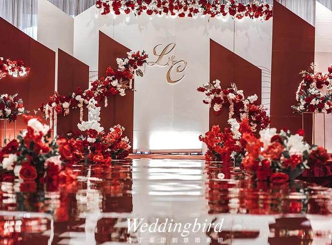
Dusty sage and cream, navy and gold, charcoal and oat—palettes that never date
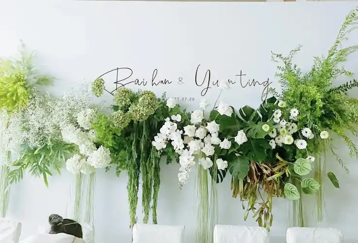
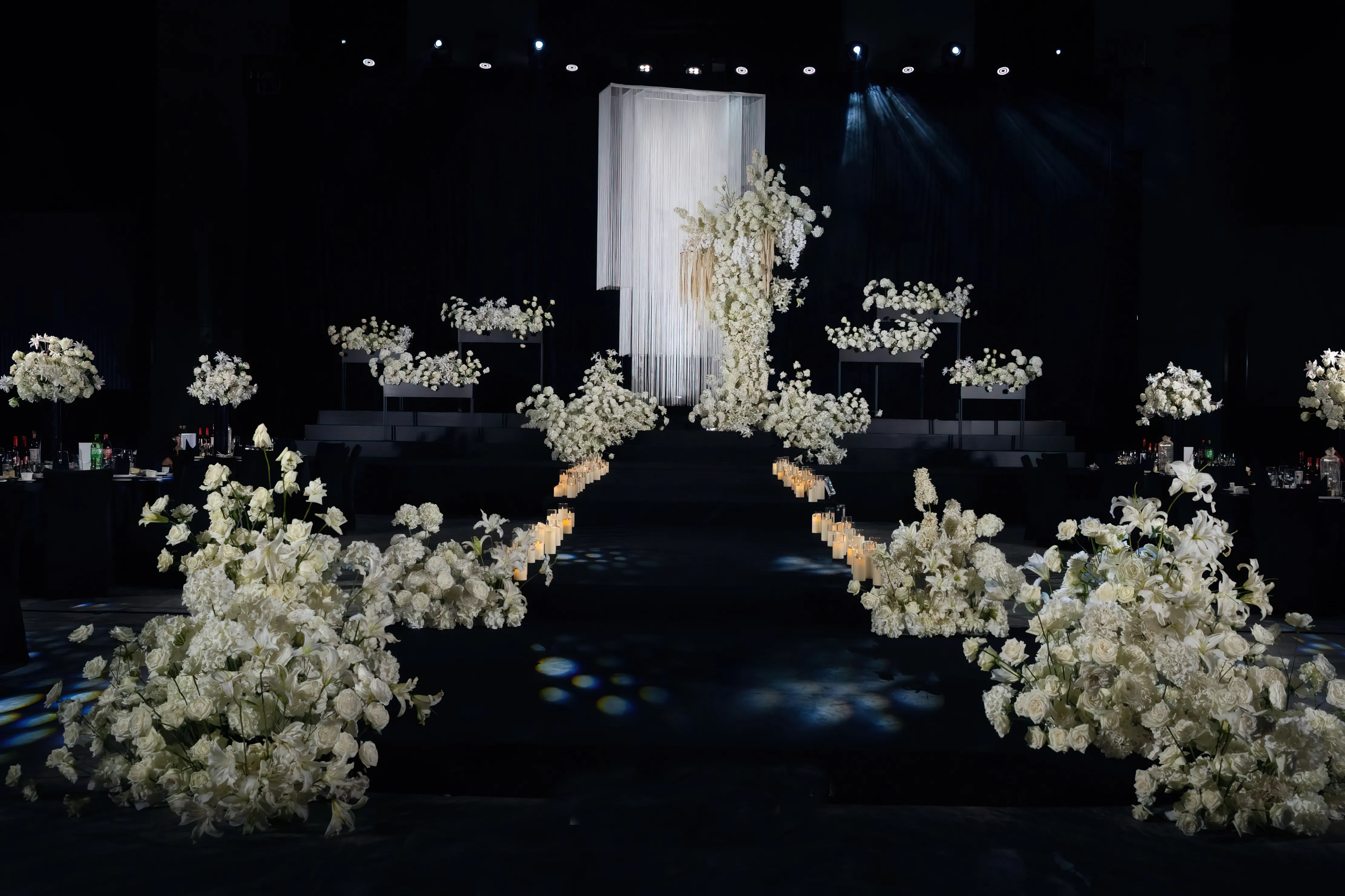
1. Classic White & Ivory with Greenery
If there is one wedding palette that never goes out of style, it is the combination of white, ivory, and abundant greenery. This palette feels clean, elegant, and universally appropriate, whether you are hosting a modern city celebration, a countryside ceremony, or a cultural wedding with traditional rituals.
Why couples love it globally
- Symbolism of purity and new beginnings: White and ivory often represent fresh starts and sincerity in many cultures.
- Neutral and adaptable: This palette works with almost any venue, from historic buildings to minimalist lofts.
- Easy to source: White flowers, neutral linens, and green foliage are widely available in most regions.
How to style this palette
Focus on texture rather than extra colors. Use white and ivory in your linens, stationery, and bridal attire, and bring life to the space through layers of greenery: garlands, potted plants, or cascading foliage on arches and staircases. Incorporate different shades of green—from soft sage to deep emerald—to keep the look interesting.
For tables, pair ivory linens with white plates and clear or gold-rim glassware. Add simple greenery runners or clusters of small arrangements rather than one large centerpiece. Candles in glass holders add warmth without disrupting the color story.
Where it shines
- Traditional church weddings and classic hotel ballrooms
- Outdoor garden or vineyard ceremonies
- Multi-cultural weddings where a neutral backdrop lets cultural outfits stand out
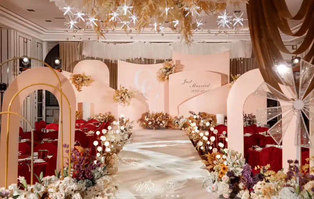
2. Blush, Champagne, and Soft Gold
Blush has become a modern classic, and when combined with champagne and soft gold, it creates a romantic, refined palette loved by couples worldwide. This combination feels soft and feminine without becoming overly sweet, especially when balanced with metallic accents.
Why it’s timeless
- Flattering for many skin tones: Blush and champagne work beautifully in bridesmaid dresses and accessories around the world.
- Luxurious but approachable: Soft gold accents suggest celebration without feeling overly formal or ostentatious.
- Seasonless: Works in spring and summer with airy fabrics, and in fall/winter with richer materials.
How to style this palette
Use blush for textiles and florals—think chiffon bridesmaid dresses, silk ribbons, and rose-toned flowers such as garden roses or ranunculus. Champagne tones can appear in table linens, stationery, and even cake frosting. Introduce soft gold in details: cutlery, candle holders, frames, and subtle foil printing on invitations.
To avoid a palette that feels too pink, ground it with a neutral like warm ivory or light taupe. You can also mix multiple shades of blush (from dusty rose to pale peach) for more depth and sophistication.
Cultural and styling notes
In some cultures, bright red is traditional for weddings. Blush, champagne, and gold can be a gentle, modern alternative that still feels festive. For example, you can pair this palette with a red or deep accent color in smaller touches, like signage or envelope liners, to nod to tradition without overpowering the overall softness.
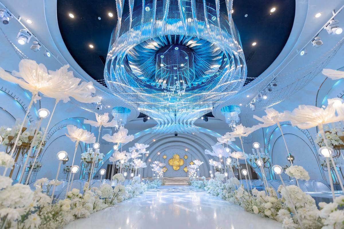
3. Navy Blue, White, and Silver
Navy blue has a stable, sophisticated presence that transcends trends. Paired with white and silver, it becomes a timeless choice for couples who prefer a clean yet dramatic contrast, or who want a chic alternative to black-and-white.
Why couples choose it
- Universally elegant: Navy is widely used in formalwear across cultures, making it easy to incorporate into suits, dresses, and décor.
- Great for evening celebrations: The deep hue works beautifully in low light with candlelight and silver reflections.
- Gender-neutral appeal: Neither too feminine nor too masculine, ideal for many couples’ tastes.
How to style this palette
Feature navy in larger elements: suits, tablecloths, or backdrop draping. Use white for balance in florals, plates, and paper goods. Silver should appear as an accent—think vases, frames, or table numbers with a subtle metallic sheen.
If you want a softer version, introduce pale blue or dove gray. For a bolder look, add a single accent color such as blush, burgundy, or emerald, but keep it controlled so the palette remains cohesive.
Where it works best
- Formal hotel or rooftop weddings
- Coastal or nautical-inspired celebrations
- Winter weddings where cool tones feel seasonally appropriate
4. Soft Pastels: Powder Blue, Dusty Rose, and Sage
Pastel combinations are beloved for their dreamy, romantic qualities. A trio of powder blue, dusty rose, and sage green creates a harmonious palette that is gentle yet visually interesting, and can be adapted to many cultural aesthetics.
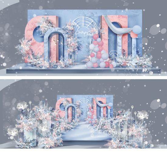
Why this combination works globally
- Soft but not childish: Dusty tones keep the palette sophisticated rather than overly sweet.
- Versatile across seasons: Light enough for spring and summer, but still lovely in fall with richer textures.
- Plays well with nature: Sage links the palette to greenery, making it easy to blend with outdoor venues.
How to style this palette
Use powder blue sparingly in table linen, ribbon details, and stationery. Dusty rose can appear in florals, bridesmaid dresses, and textiles. Sage ties everything together in foliage and accent pieces such as napkins or candles.
To avoid a scattered look, choose one color as the “lead” and the other two as supporting accents. For example, let sage and green foliage be the dominant base, with powder blue in smaller decorative elements and dusty rose in the florals and fashion.
Cultural considerations
Pastels can be especially appealing for daytime or outdoor ceremonies, and they also pair beautifully with traditional outfits featuring embroidery or intricate details. In cultures where bright colors are common, you can add a richer accent (such as marigold or deep pink) in small touches alongside this pastel base.
5. Black, White, and Metallic Accents
Black and white is the ultimate modern classic. It feels architectural, dramatic, and incredibly clean, especially when combined with metallic accents such as gold or silver. Although black is not traditionally associated with weddings in some cultures, today it is widely embraced for its sophistication.
Why it remains iconic
- Instantly chic: The high contrast of black and white gives a polished, editorial feel.
- Flexible metallic options: Gold adds warmth and opulence; silver feels sleek and contemporary.
- Supports any accent color: If you want to add a cultural or personal color, black and white offer the perfect backdrop.
How to style this palette
Consider black for stationery (menus, place cards), table runners, or chairs, while keeping linens and larger surfaces white to prevent the space from feeling too dark. Add metallics in candle holders, cutlery, vases, and frames. Minimalist floral arrangements—such as all-white blooms with dark foliage—reinforce the clean aesthetic.
If you want a slightly softer approach, swap true black for charcoal grey and pure white for warm ivory; the result is more approachable while retaining a refined feel.
Adapting across cultures
In regions where black may traditionally be associated with mourning, you can treat it as an accent rather than a dominant color. For example, pair white and gold with just a touch of black in calligraphy or ribbon details so that the palette still feels celebratory and respectful of local customs.
6. Emerald, Gold, and Cream
Jewel tones bring depth and richness to a wedding design, and emerald green is one of the most beloved. Paired with gold and cream, it creates a luxurious palette that feels equally at home in a grand ballroom or an outdoor garden, and it resonates with many cultural traditions where green symbolizes growth and good fortune.
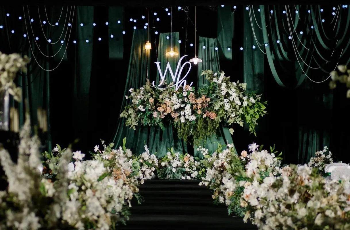
Why emerald works so well
- Symbolism: In many cultures, green represents life, prosperity, and new beginnings.
- Versatile with nature: Emerald can appear in fabrics and décor, while natural greenery echoes the tone.
- Pairs with gold beautifully: Gold adds warmth and a celebratory feel without overpowering the palette.
How to style this palette
Highlight emerald in textiles and fashion: velvet table runners, bridesmaid dresses, or groomsmen accessories such as ties and pocket squares. Use cream as the softer counterpart in florals, stationery, and cake details. Gold can appear in frames, vases, candle holders, and embroidered details on clothing.
For a more organic aesthetic, layer various shades of green (from sage to deep emerald) and keep gold minimal. For a glamorous look, intensify the gold elements and add reflective surfaces such as mirrors or glass chargers.
Seasonal and cultural flexibility
This palette is ideal for autumn and winter weddings, but it can also feel fresh in spring when paired with white florals. In multi-cultural weddings, emerald and gold can complement traditional outfits that feature rich embroidery and jewelry, tying the entire visual experience together.
7. Dusty Blue, Grey, and Ivory
Dusty blue has emerged as a favorite neutral-like hue, offering color without intensity. Combined with soft grey and ivory, it creates a calm, airy palette that feels timeless and romantic, suitable for both classic and modern weddings.

Why couples love it
- Soft yet distinct: Dusty blue stands out from pure neutrals but never steals the show.
- Perfect for light-filled venues: The palette reflects natural light beautifully.
- Looks elegant in photos: The combination photographs well and ages gracefully over time.
How to style this palette
Use dusty blue as a primary accent color in napkins, ribbons, and paper goods. Let grey appear in suits, table chargers, or minimalist vases. Ivory remains the balancing neutral for linens, florals, and bridal attire.
A key to this palette is restraint—keep the tones soft and consistent. Avoid pairing very bright or primary colors with dusty blue; instead, stick to muted shades that share the same gentle character.
Where it works beautifully
- Coastal or lakeside weddings, where blue reflects the natural surroundings
- Historic venues with stone, grey walls, or neutral interiors
- Daytime weddings where soft light enhances the airy atmosphere
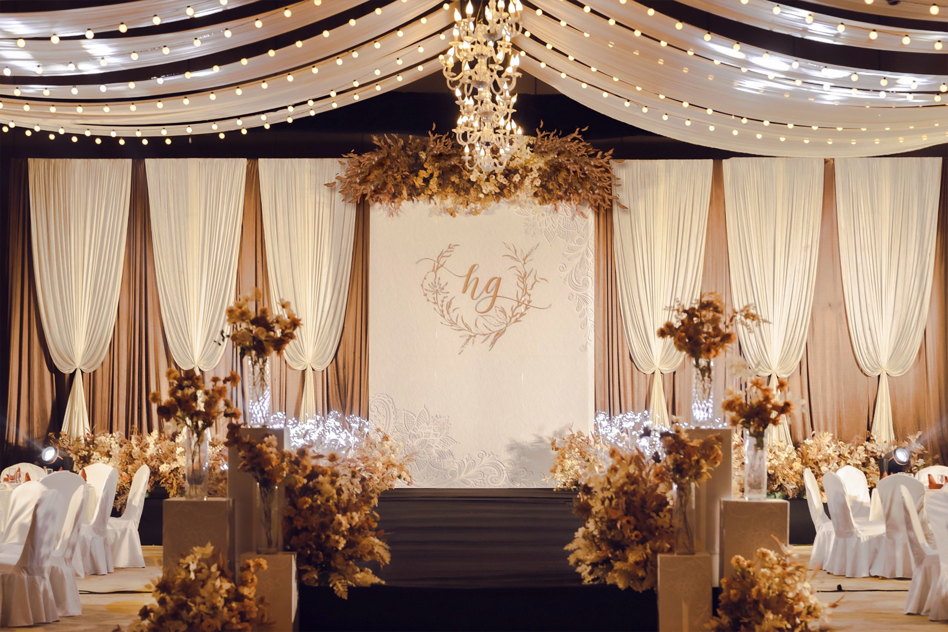
8. Terracotta, Rust, and Cream
For couples drawn to earthy, grounded aesthetics, terracotta and rust combined with cream offer a warm, modern, and globally appealing palette. These colors echo natural clay, sunsets, and traditional textiles, making them especially popular for boho, desert-inspired, or rustic weddings.
Why this palette is rising yet timeless
- Connection to nature: Earth tones feel organic and comforting across cultures.
- Highly photogenic: Warm hues look beautiful in natural light and sunset photography.
- Pairs with many neutrals: Works with ivory, sand, tan, and even muted greens.
How to style this palette
Incorporate terracotta and rust in ceramics, vases, candle holders, and textiles such as table runners or throw blankets in lounge areas. Use cream in linens, bridal attire, and as the base color for stationery. Add dried florals, pampas grass, and greenery in muted tones to enhance the organic look.
To keep the palette from feeling too autumnal, mix in lighter neutrals and fresh greenery, and use rust as an accent rather than a dominant tone. For a more dramatic approach, deepen the terracotta and add hints of chocolate brown or deep burgundy.
Global and seasonal adaptability
While this palette is often associated with fall, it can be adapted for summer in outdoor or destination weddings by keeping fabrics light and airy. In regions with strong craft traditions, terracotta and rust can be reflected in local pottery or textiles, creating a meaningful connection to place and heritage.
9. Burgundy, Blush, and Gold
Burgundy and blush create a powerful contrast between depth and softness. When combined with gold, the result is a romantic, opulent palette that reads well in many cultures where deep red or wine tones carry meanings of love, passion, and good fortune.
Why this palette endures
- Rich symbolism: Deep reds and burgundies are often associated with celebration and auspicious occasions.
- Ideal for fall and winter: The colors feel cozy and luxurious in cooler seasons.
- Balances bold and soft: Burgundy provides drama, while blush keeps the look romantic.
How to style this palette
Use burgundy in statement florals, groom or guest attire, and key decor elements like draping or backdrops. Blush can appear in bridesmaid dresses, secondary florals, and textiles. Gold should be a unifying accent in cutlery, frames, candle holders, and stationery details such as foil stamping.
To prevent the palette from feeling too heavy, incorporate plenty of cream or ivory and ensure that venues have adequate lighting. Candlelight, string lights, and reflective elements will enhance the richness of the colors without making the space feel dark.
Cross-cultural possibilities
In multi-cultural weddings, burgundy and blush can be paired with brighter traditional reds or jewel tones in clothing and accessories. This allows couples to honor cultural color symbolism while keeping the overall design cohesive and modern.
10. Soft Lavender, Lilac, and Dove Grey
Purple tones have long been associated with royalty and spirituality in many cultures. Soft lavender and lilac, combined with dove grey, offer a gentle interpretation of this royal color family, resulting in a serene yet distinctive palette.

Why this palette remains a favorite
- Unique but not overpowering: Lavender is less common than blush or ivory, giving your wedding a subtle point of difference.
- Romantic and calming: The palette feels peaceful and dreamy, ideal for intimate celebrations.
- Works with nature: Lavender fields, wisteria, and lilac blooms offer natural sources of inspiration.
How to style this palette
Feature lavender and lilac in florals, candles, and textiles such as napkins or table runners. Use dove grey in suits, stationery, and small decor elements like ribbon or chair sashes. Ivory or white should be present as a backdrop to keep the palette light and balanced.
To deepen the palette for evening or cooler seasons, pair lavender with slightly darker purple tones or even hints of navy. For an airy daytime look, keep the purples pale and combine them with abundant greenery and white.
Cultural and stylistic notes
This palette can be adapted to different cultures by incorporating traditional elements in complementary colors. For example, silver jewelry, embroidered textiles, or regional florals in similar tones can create a cohesive yet culturally specific look. Lavender also pairs beautifully with neutral traditional attire, adding a gentle layer of color to the overall scene.
Bringing Your Timeless Palette to Life
Choosing a wedding color palette is about more than aesthetics. It’s an opportunity to reflect your personalities, your shared story, and the cultural influences that matter to you both. The 10 palettes above—from classic white and greenery to rich jewel tones and soft pastels—are popular globally because they adapt gracefully to different traditions, venues, and seasons.
As you finalize your colors, keep these practical tips in mind:
- Start with three to four key colors: A primary color, one or two supporting tones, and a neutral will be easier to manage than a long list of hues.
- Consider your venue: Existing wall colors, flooring, and lighting can influence how your chosen palette will actually appear in person and in photos.
- Think across every element: Apply your palette consistently—florals, stationery, attire, linens, and even food presentation can all echo your chosen colors.
- Respect cultural meanings: Research the symbolism of certain colors in your cultures and those of your guests. Adjust intensities or combinations as needed to keep your celebration inclusive and respectful.
- Work with your suppliers: Share a clear color reference (mood board, fabric swatches, or digital palette) with your planner, florist, and décor suppliers so everyone is aligned.
Ultimately, a timeless palette is one that still feels like “you” when you look back at your photos many years from now. Whether you choose soft neutrals, romantic pastels, bold jewel tones, or something in between, let your colors support the love story you are celebrating—not overshadow it. With thoughtful choices and a bit of creativity, any of these ten palettes can become the perfect canvas for your global, unforgettable wedding day.
More Articles
 Wedding Planning Guest Transportation Shuttle Services
 Wedding Planning How to Manage the Ring Exchange Moment
 Wedding Transportation Options for You and Your Guests
 Wedding Vendor Payment Schedule Best Practices
Wedding Venue Capacity Rules and Fire Codes
Wedding Vendor Payment Schedule Best Practices
Wedding Venue Capacity Rules and Fire Codes
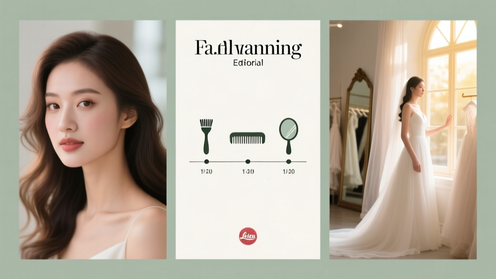 Wedding Day Hair and Makeup Timeline Planning
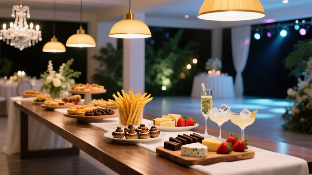 How to Plan a Wedding With a Late-Night Snack Station
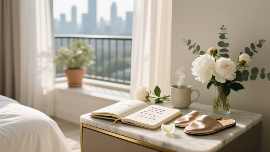 Wedding Planning How to Create a Stress-Free Morning
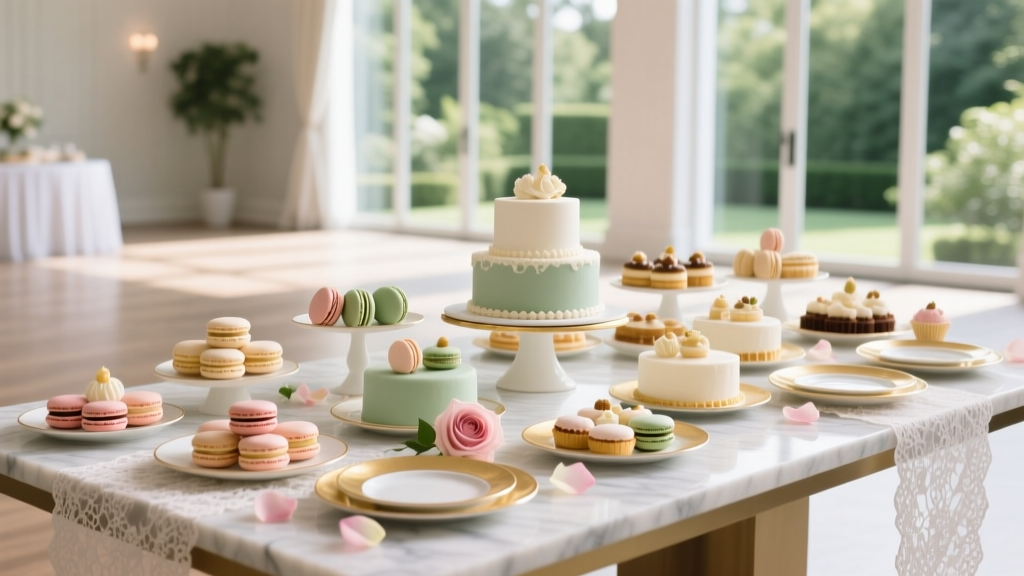 How to Plan a Wedding With a Dessert Table Instead of Cake
 Wedding Bar Planning Open Bar vs Cash Bar