How to Plan a Wedding With a Unified Color Palette
You know that feeling when you start saving wedding photos and everything looks gorgeous… but your saved folder is a mix of ten different vibes? One photo is soft blush and candlelight, the next is crisp black-and-white, and suddenly you’re wondering, “How do we make this feel like us—and not like a random collage?” A unified wedding color palette is one of the simplest ways to make your day look intentional, polished, and personal.
Here’s the good news: you don’t need a designer budget or a “perfect” eye for color. You just need a clear plan—one that keeps you from overbuying décor, helps vendors understand your vision quickly, and makes every detail (from invitations to florals to attire) feel like it belongs together.
This guide walks you through choosing and applying a cohesive wedding color scheme step-by-step, with real-world examples, budget-friendly tips, and common mistakes wedding planners see all the time—so you can avoid them.
What a “Unified Color Palette” Really Means
A unified color palette isn’t about making everything match perfectly. It’s about creating consistency—so your ceremony space, reception décor, wedding party attire, stationery, and personal details feel connected.
Think “coordinated,” not “identical”
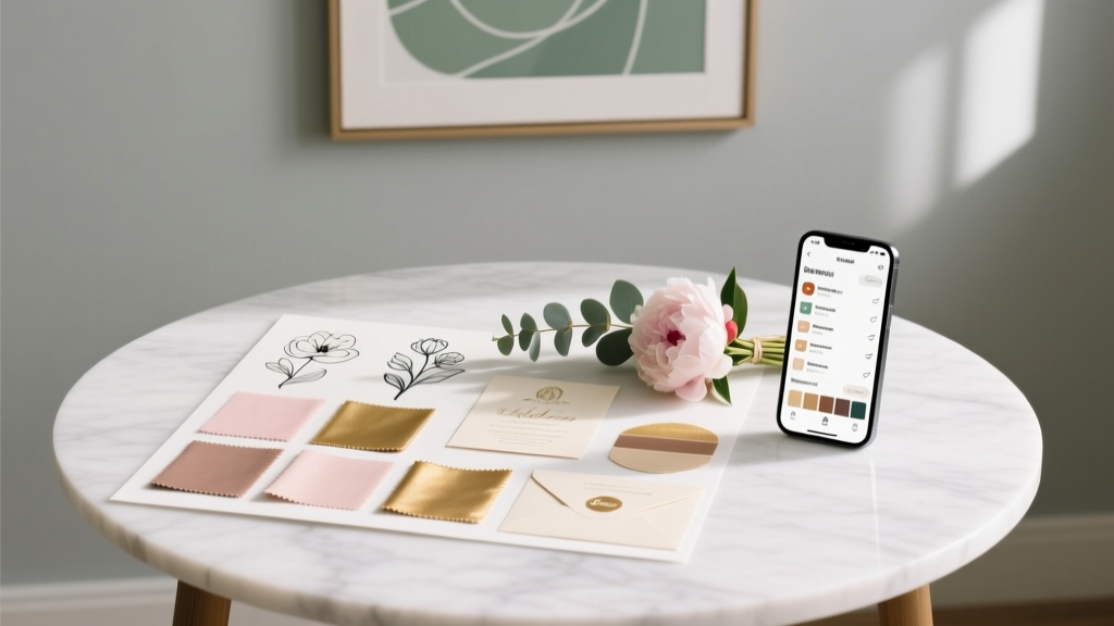
- Palette = your curated set of colors (usually 3–5) plus neutrals/metallics.
- Balance = some elements are bold, others are subtle.
- Repetition = colors appear in more than one place, so they feel purposeful.
A helpful rule of thumb
- 1 dominant color (the main vibe)
- 1–2 supporting colors (adds depth)
- 1 accent color (small pops)
- 1–2 neutrals (white, ivory, taupe, gray, black)
Step-by-Step: How to Choose Your Wedding Color Palette
Step 1: Start with your “anchor” (season, venue, or vibe)
Pick one strong anchor before choosing colors. This keeps you from chasing every pretty idea online.
- Season: Spring pastels, summer brights, autumn earth tones, winter jewel tones or monochrome.
- Venue: Garden, beach, barn, modern loft, ballroom, backyard.
- Style: Romantic, classic, minimalist, whimsical, vintage, editorial, boho.
Real-world scenario: If your venue has warm wood beams and amber lighting, icy blue and cool silver might fight the space. But sage + cream + warm brass will feel effortless and elevated.
Step 2: Look at your venue’s built-in colors (don’t ignore them)
The venue is the biggest “decor item” you’re paying for—so work with its palette.
- Carpet, draping, chairs, wall color, lighting temperature
- Outdoor surroundings (greenery, sand, mountains, city skyline)
- Tables, linens, or anything included in the rental package
Planner tip: Take photos of the venue at the time of day your wedding will happen. Morning sun and evening candlelight can make the same color look totally different.
Step 3: Choose neutrals first (your palette’s “glue”)
Neutrals make your accent colors look intentional, and they save money because they’re easy to source.
- Warm neutrals: ivory, cream, beige, taupe, mocha
- Cool neutrals: crisp white, slate, charcoal, black
- Texture neutrals: natural linen, wood, stone, rattan
Step 4: Pick your main color—and decide on the mood
Before you add “more,” define what your main color should feel like:
- Romantic: dusty rose, blush, mauve
- Fresh: sage, eucalyptus, soft blue
- Bold: emerald, cobalt, fuchsia
- Moody: burgundy, terracotta, deep plum
Budget note: If you want a dramatic color, consider using it in linens or stationery rather than massive floral installs. Flowers in rare shades can cost more, especially out of season.
Step 5: Add 1–2 supporting colors (this is where it gets “designer”)
Supporting colors keep the palette from feeling flat. Think of them as the bridge between your main color and your neutrals.
- Main: sage → Support: soft ivory + dusty blue
- Main: navy → Support: champagne + soft blush
- Main: terracotta → Support: sand + olive
Step 6: Choose one accent and one metallic (optional, but powerful)
Accents are your “sparkle” moments—used in smaller doses.
- Accents: black, mustard, lilac, cranberry, emerald
- Metallics: gold (warm), silver (cool), rose gold (soft warm), brass (vintage warm)
Pro tip: If you’re unsure about metallics, look at the venue lighting and your ring metal. Warm light loves gold/brass; cool modern spaces often suit silver/chrome.
Color Palette Checklist: Make It Cohesive Across the Whole Wedding
Once you’ve chosen the palette, the next step is applying it consistently—without going overboard.
Use this “color placement” formula
- Big areas (50–60% neutral): linens, draping, chairs, tableware
- Medium areas (30–40% main/support): florals, bridesmaid dresses, signage, napkins
- Small pops (10% accent/metallic): candles, ribbons, escort cards, cake details, ties/pocket squares
Where your palette should show up (and where it doesn’t need to)
- Stationery: invitations, envelopes, day-of paper, place cards
- Attire: wedding party outfits, ties, pocket squares, bouquets
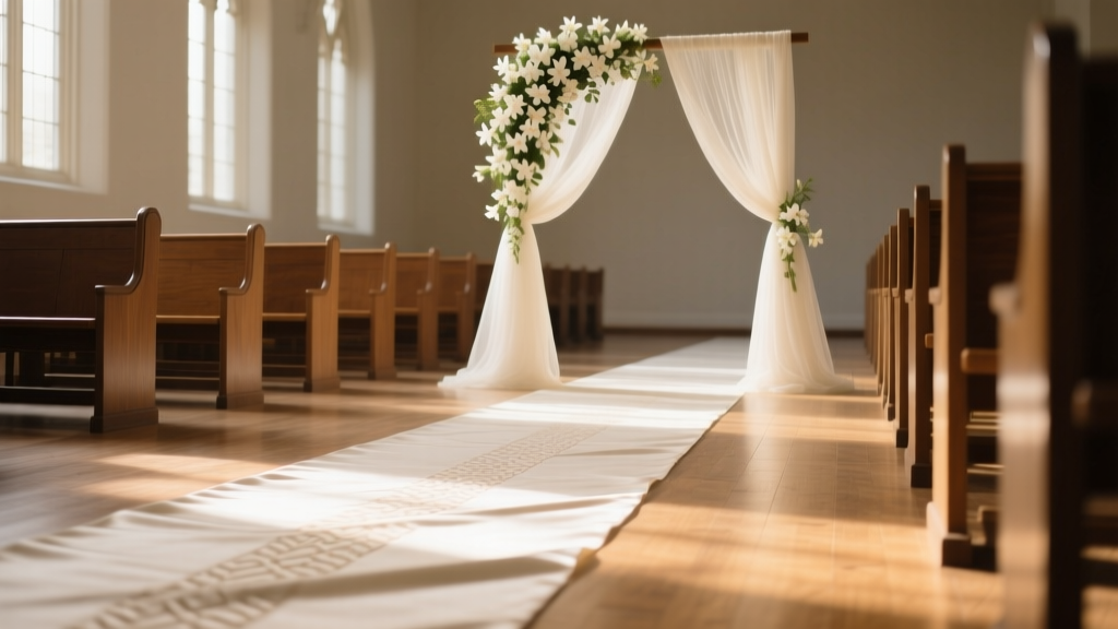
- Ceremony: aisle markers, arch/floral design, chair ribbons (optional)
- Reception: linens, centerpieces, bar menu, candles, signage
- Details: cake, guest book, favors, photo booth backdrop
Give yourself permission to skip: Not every item needs a color moment. A cohesive wedding aesthetic often comes from restraint.
Real-World Palette Examples Couples Actually Use
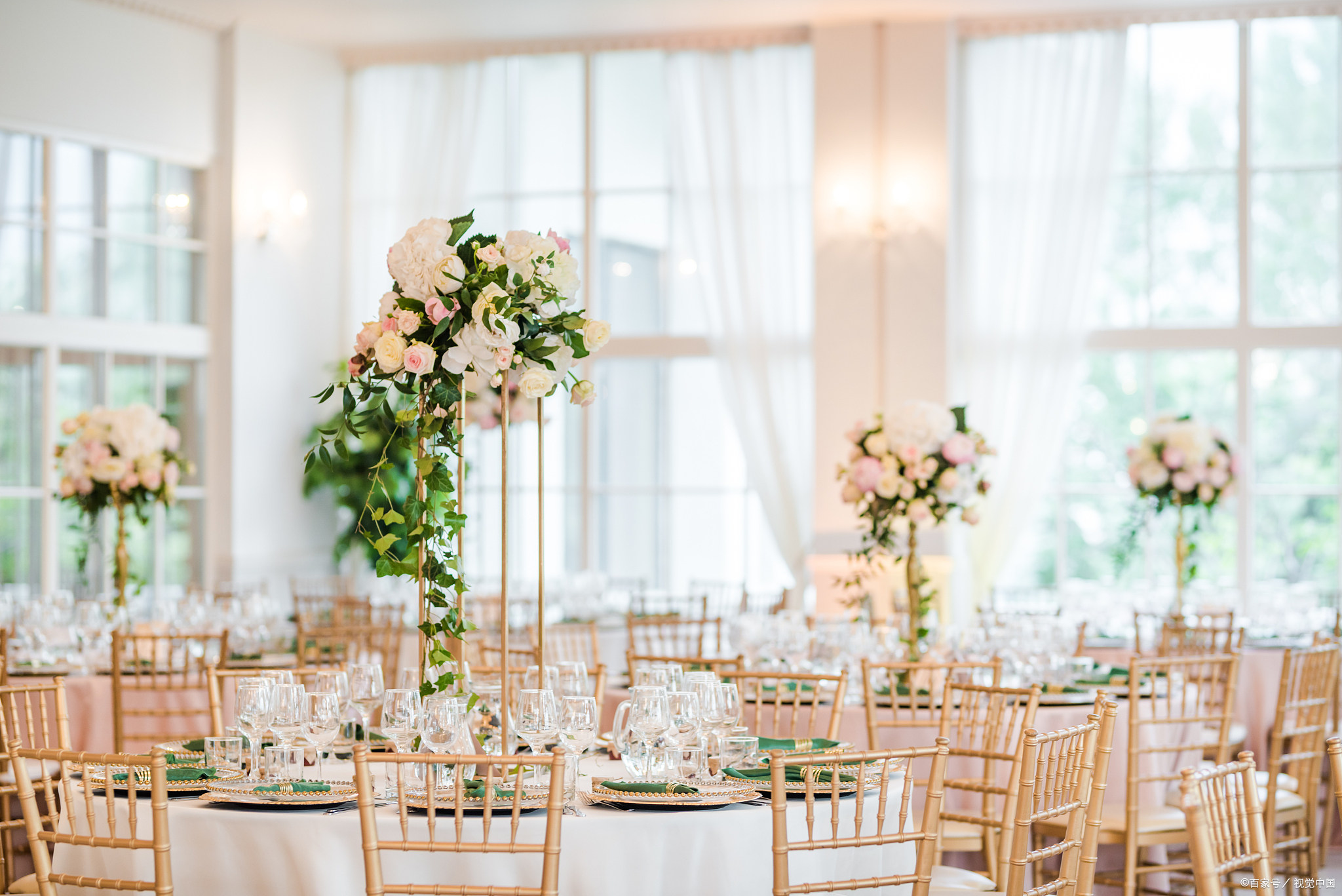
Example 1: Classic ballroom wedding (timeless and polished)
- Palette: ivory + black + champagne gold
- What it looks like: ivory linens, black tuxes, gold candleholders, white florals
- Budget-friendly trick: Use greenery and candles to create fullness instead of all-white premium blooms.
Example 2: Garden wedding in late spring (soft and romantic)
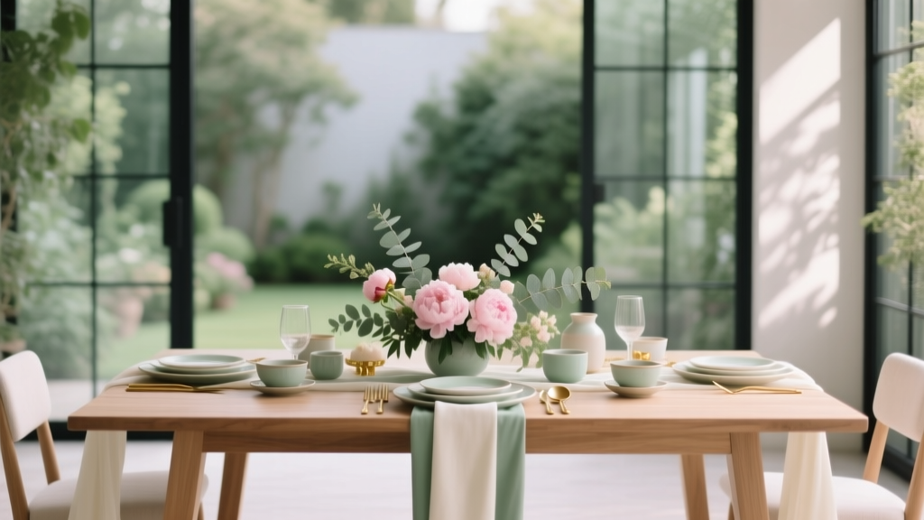
- Palette: blush + sage + cream + touches of warm gold
- What it looks like: mismatched pastel bridesmaid dresses in the same tone family, airy florals, linen napkins
- Common snag: Too many “extra” pastels (lilac + peach + blue + pink) can start to look chaotic. Choose two and repeat them.
Example 3: Modern loft wedding (minimal, elevated, slightly edgy)
- Palette: white + charcoal + muted terracotta
- What it looks like: clean white tables, charcoal menus, terracotta blooms, warm candlelight
- Pro tip: Add texture (matte paper, linen, ceramic vases) so minimal doesn’t feel plain.
Example 4: Beach wedding (bright but still cohesive)
- Palette: sand + seafoam + sky blue + coral accents
- What it looks like: light airy linens, blue patterned napkins, coral in bouquet ribbons
- Budget tip: Let the ocean be the “decor.” Keep florals smaller and lean into natural elements.
Timeline: When to Lock Your Colors (So You Don’t Re-Do Everything)
- 12–10 months out: choose your general wedding style and season mood
- 10–8 months out: finalize your color palette before booking florist, rentals, and stationery
- 7–5 months out: align attire (wedding party colors), linens, and key décor rentals
- 4–2 months out: finalize signage, day-of paper goods, candle colors, small details
- Final month: do a “palette audit” to ensure nothing clashes (more on that below)
Planner reality: It’s normal for your palette to evolve slightly—but frequent changes get expensive fast once deposits are down.
Budget Considerations: Where Color Choices Can Save (or Cost) You
Spending smart
- Save on linens: Choose neutral tablecloths and add color with napkins, runners, and candles.
- Save on flowers: Use in-season blooms and let color come from ribbons, linens, and paper goods.
- Save on bridesmaid dresses: Pick a color family (like “dusty blues”) and let each person choose a shade within it.
Where color can increase costs
- Custom-dyed items: linens, ribbons, specialty fabrics
- Out-of-season florals: especially specific shades (true blue, certain peaches, unusual purples)
- Multiple bold colors: can require more rentals and design work to make it look intentional
Common Mistakes to Avoid (and What to Do Instead)
- Mistake: Choosing colors from a phone screen only.
Do instead: Print swatches or order linen/dress samples. Lighting changes everything. - Mistake: Using too many accent colors.
Do instead: Pick one accent and repeat it 3–5 times across the day (not everywhere, just consistently). - Mistake: Ignoring undertones (warm vs. cool).
Do instead: Decide if you’re warm (ivory, gold, terracotta) or cool (bright white, silver, true blue) and keep it consistent. - Mistake: Making every item match exactly.
Do instead: Mix shades and textures within the same color family for a more high-end look. - Mistake: Picking colors before choosing the venue.
Do instead: Let the venue guide the palette so it feels natural and cohesive.
Wedding Planner Pro Tips for a Seamless Color Story
- Create a one-page color palette card with 3–5 swatches, neutrals, and metallics. Share it with your florist, stationer, rental company, and planner.
- Use “color echoes”: repeat your accent in small ways (wax seals, menu borders, ribbon, signature drink garnish).
- Choose one hero moment where color is boldest—like the ceremony arch, bridesmaid dresses, or reception tablescape—and keep everything else supportive.
- Do a final palette audit 3–4 weeks out:
- Do attire colors clash with florals?
- Do linens fight the venue carpet/walls?
- Are your signage backgrounds readable?
FAQ: Planning a Wedding With a Unified Color Palette
How many wedding colors should we choose?
Most couples do best with 3–5 colors total (including neutrals). If you want a broader look, use multiple shades of the same color family (like dusty blue + slate + navy) rather than adding completely new colors.
What if we love two totally different palettes?
Try merging them through a shared neutral. For example, one person loves black-and-white and the other loves blush: build a palette of ivory + black + blush + soft gold. You’ll get contrast and romance without the “split theme” feeling.
Do bridesmaids have to match the palette exactly?
No—and it often looks better when they don’t. A cohesive wedding party look can be achieved with:
- one color family (all greens, all blues, all neutrals)
- matching fabric (all satin or all chiffon)
- consistent tone (all muted or all bright)
How do we make bright colors look classy and not like a kids’ party?
Use bright colors as accents and anchor them with neutrals. For example: crisp white linens + colorful napkins + simple white florals + a bright signature cocktail. Also limit the number of bright hues—one main bright color plus one supporting shade is usually plenty.
Can we change our colors after booking vendors?
You can, but do it strategically. If you’ve already booked your florist and rentals, shifting your palette might mean change fees or re-ordering items. If you’re itching to tweak, adjust accents (napkins, candles, paper goods) instead of changing your core colors.
How do we communicate our palette to vendors clearly?
Send a simple design board or one-page palette document with:
- color swatches (and names like “dusty rose,” not “pink”)
- 2–3 reference photos that match your venue/style
- notes on what you want to feel (romantic, modern, moody)
Your Next Steps: Make Your Palette Feel Effortless (and Totally You)
If you want a unified color palette without second-guessing every decision, keep it simple:
- Choose your anchor (season + venue + vibe).
- Pick neutrals first, then one main color, then 1–2 supporting colors.
- Select one accent and/or metallic for small pops.
- Apply the palette using the “big/medium/small” placement formula.
- Share a one-page palette card with your vendors and do a final palette audit before the wedding.
Your wedding doesn’t need to look like anyone else’s. When your colors are consistent and thoughtfully repeated, the day feels calm, intentional, and deeply personal—exactly what you want when you’re walking into one of the biggest moments of your life.
More support: Explore more wedding planning guides on weddingsift.com to keep building a celebration that feels beautiful, organized, and unmistakably yours.
More Articles
 Wedding Planning How to Choose Ceremony Aisle Runners
 Micro Wedding Planning Guide for Intimate Celebrations
 Ultimate Wedding Planning Checklist for Your Big Day
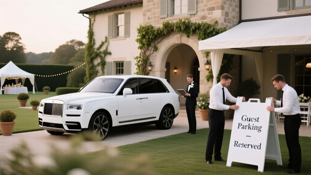 Wedding Parking and Logistics Planning Guide
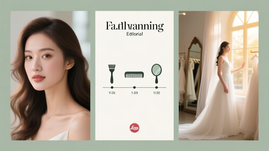 Wedding Day Hair and Makeup Timeline Planning
 Wedding Planning Seasonal Flower Availability Guide
 White linen, dried pampas, and one thrifted brass tray—minimalist wedding decor that costs less than your dinner budget
 How to Plan a Themed Wedding From Concept to Execution
 Second Time Around Wedding Planning Tips and Ideas
 Wedding Day Weather Backup Plans That Actually Work